


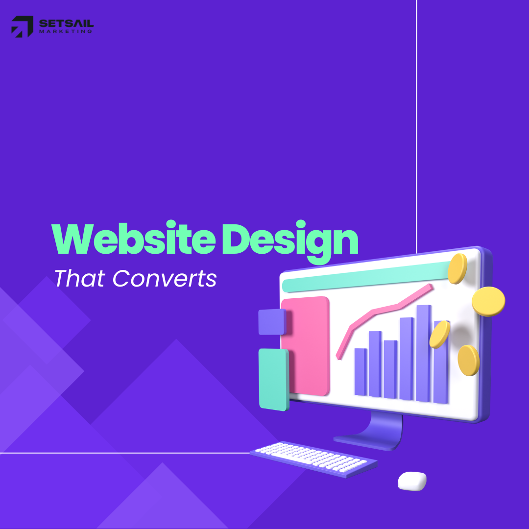
Website Design That Converts: The Psychology Behind High Performing Pages
Discover the psychology behind website design that converts, including layout, trust signals, user behavior, and persuasive elements that drive higher engagement and sales.

Jason Atakhanov
14 mins
February 18, 2026
Your website is working hard. Ads send traffic, your team sends prospects, word of mouth sends warm referrals yet too many visitors click away without calling, booking, or buying. That gap between interest and action is exactly where website design that converts earns its keep. And yes, there is real psychology behind why some layouts, messages, and calls to action move people while others leave them cold.
In this article, we’ll walk through the human decision making principles that sit underneath high performing websites and turn them into practical design moves you can brief to your team or agency. If you lead marketing for a city, utility, or growing brand, you’ll walk away with a clear lens for spotting what’s helping or quietly hurting conversions on your current site.
TL;DR:
- A clear definition of what “good” looks like for a website that actually converts, not just one that looks nice.
- The core psychology principles that shape how people read, trust, and click online.
- A simple framework for how to design a website that converts, page by page.
- Practical ways to measure results and know when it’s time to bring in a specialist agency like Setsail Marketing.
What Makes a Website Design That Converts?
Let’s get on the same page: a “conversion” is the moment a visitor does what you wanted them to do. That could be booking an inspection, reporting an issue to your city, scheduling a demo, or buying an e‑bike.
A website design that converts consistently lines up three things on every key page:
- The right visitor and context – Who are they, what brought them here, and how aware are they of your solution?
- One core action – The single step that matters most right now (call, book, apply, buy).
- A clear, low friction path – Every section on the page either builds trust, answers a concern, or nudges toward that action.
If you want a deeper partner in shaping that kind of experience, our conversion focused web design & development services were built exactly for this.
“A high-performing website doesn’t try to say everything. It says the right thing at the right moment to the right visitor.”
The Psychology Behind High Performing Websites
Great UX and strong conversion rates grow from the same soil: understanding how people actually make decisions. Here are a few of the big psychological levers that shape website design that converts.

Cognitive Load: Make Thinking Easy
Cognitive load is the mental effort required to process information. Every extra option, paragraph, or pop up adds more “weight” to the visit. When the page feels heavy, people postpone decisions or bail completely. Research like UX research on cognitive load shows that simplifying choices and layouts can improve task completion and satisfaction.
- Group related content into clear sections with helpful subheadings.
- Use concise copy and short paragraphs, especially near key calls to action.
- Break long journeys (like applications or bookings) into simple, numbered steps.
Visual Hierarchy: Guide the Eye
Visitors skim first and read second. Your layout needs to guide attention in this order:
- Who you are and what you help with.
- Why this matters to them right now.
- What they should do next.
Headlines, font size, spacing, and color should all point toward that primary action whether that’s “Report an outage”, “Book a consult”, or “Get a quote”.
Social Proof & Trust
People feel safer making a choice when they see others have made the same one. Logos, testimonials, case studies, and stats act as shortcuts for trust.
For public sector sites, this might look like clear endorsements, community outcomes, or service stats. For ecommerce and B2B, think reviews, star ratings, and independent UX research that backs up your design choices.
Loss Aversion & Friction
Humans feel losses more strongly than gains. On a website, “loss” can mean wasted time, confusion, or fear of making a bad choice. Simple design tweaks reduce that feeling:
- Explain exactly what happens after a click (“You’ll get a response in 1 business day”).
- Highlight low risk steps like free trials, pilot projects, or no penalty cancellations.
- Cut any questions on forms you don’t truly need right now.
Consistency & Familiar Patterns
Visitors bring expectations from every other site they’ve used: logo in the top left, contact in the header, footer links for deeper details. When you respect those patterns, visitors spend less mental energy figuring out “how this thing works” and more on your message.
How to Design a Website That Converts (Step By Step)
Here’s a straightforward framework you can use with your internal team or with a partner like Setsail when planning website design that converts.

1. Choose One Primary Goal Per Page
Every key page should have one job. For example:
- Homepage: route visitors to the right section quickly.
- Service page: convince qualified visitors to book a consult.
- Campaign landing page: get signups for a specific program.
Secondary actions (newsletter, social follows) are fine, but they should never steal the spotlight from that primary goal.
2. Map Visitor Questions Before Layout
Before wireframing, list the top questions your visitor has. For a municipal campaign, these might be “Am I eligible?”, “How much time will this take?”, and “What if I disagree?”. For a B2B service, think “Will this work for my industry?” and “How hard is implementation?”.
Each question should have a clear home on the page: a short section, a simple explainer graphic, or a tight FAQ block.
3. Structure the Page Around a Story
A reliable outline for a high intent page looks like this:
- Hero: Clear outcome focused headline + short subhead + primary CTA.
- Proof: Logos, testimonials, or stats that show “this works”.
- How it works: 3–5 step process.
- Details: Deeper copy, imagery, or specs.
- Objections: FAQ and reassurance (timelines, budget, support).
- Final CTA: Repeat the main action with supporting copy.
4. Design Forms and CTAs for Real People
Form and button design are where the psychology meets the numbers. A few guidelines:
- Use action oriented button copy (“Get a quote”, “Book a demo”, “Report an issue”).
- Match the button label to the visitor’s mental state: early in the journey, “Learn more”; later, “Get started”.
- Group form fields logically and trim any that feel nosy too early.
If your forms are feeding into marketing automation, make sure your automation setup supports fast, human follow up especially for high intent leads.
Best Practices for Key Page Types
Homepage: Fast Routing, Not a Novel
Your homepage is closer to a train station than a destination. Its job is to help each visitor find the right “platform” in seconds.
- Make your primary value proposition impossible to miss above the fold.
- Offer 3–5 clear paths that map to your main audiences or services.
- Show a small slice of social proof early logos, stats, or a short quote.
Service or Program Pages: Depth With Direction
These pages turn interest into intent. For Setsail clients, we often structure service pages like PPC & media buying to mirror how a strong sales conversation flows.
- Lead with outcomes, not features.
- Explain the process in plain language with a simple visual or list.
- Sprinkle proof throughout the page, not just in one testimonial wall.
Campaign Landing Pages: One Offer, One Action
For campaigns, keep the page tightly focused on the one action your media spend is driving. Strip out navigation distractions, keep the copy tightly aligned with your ads, and repeat the key promise in every scroll depth.
Need inspiration? Explore our case studies to see how high performing landing pages look in the wild for cities, utilities, and high growth brands.
Measuring Whether Your Website Design Converts
Good design decisions are easier when you can see what’s working. At a minimum, make sure you have:
- Clear conversions set up in your analytics platform (submissions, calls, purchases, form starts).
- Channel level tracking so you can see how paid, organic, and social traffic convert separately.
- Heatmaps or session recordings to spot friction on key forms and flows.
If you’re new to these tools, resources that outline heatmap best practices can help your team interpret scroll, click, and move maps without overreacting to noisy data.
From there, watch a few North Star metrics:
- Conversion rate for each primary goal page.
- Time to first action (how long it takes visitors to click or interact meaningfully).
- Drop off points in forms or multi step processes.
As your data matures, layer in experiments so you’re not redesigning based on hunches; a solid A/B testing guide can help you choose sample sizes, avoid false positives, and interpret lifts responsibly.
If your team needs help with measurement, our ROI Framework brings together analytics, testing, and creative experimentation so that improvements to website design that converts are backed by real data, not guesswork. See our blog on how to build a website that converts in 2026.
Common Website Design Choices That Quietly Kill Conversions
Here are patterns we see again and again when auditing sites across North America.
- Overloaded navigation: When everything is a priority, nothing is. Collapse rarely used items into the footer or a secondary menu.
- Carousel heroes: Banners that swap every few seconds ask visitors to chase your message. Pick one main story and stick with it.
- Weak or generic CTAs: “Submit” and “Click here” don’t set expectations. Use language that reflects the real life outcome of the click.
- Walls of text: Long, uninterrupted paragraphs push readers to skim past key points. Shorten and break content into digestible chunks.
- Inconsistent design: Random button styles, misaligned headings, and clashing colors chip away at trust, especially for public sector or financial services sites.
Running a structured UX and CRO audit before your next redesign can surface these issues quickly. You can start with a simple internal checklist or bring in a team like Setsail for a deeper SEO & UX review.
When to Bring in a Conversion Focused Web Agency
Not every site needs a full rebuild. But there are clear signs it’s time to call in a specialist partner.
- Your paid campaigns are strong, but landing pages lag behind on conversion rate.
- Stakeholders keep adding content and sections, and the site now feels like a patchwork of different eras.
- You can’t tie website performance back to leads, signups, or revenue with confidence.
- Internal teams are stretched thin and projects stall for months.
In one healthcare web design project for No Fear Counselling, simplifying the booking flow and modernizing the site experience contributed to a 200% increase in online bookings, a 60% rise in conversions, and an 85% boost in mobile engagement after launch.
As a Google Partner & B Corp, Setsail Marketing pairs conversion focused website design with media buying, SEO, and automation. Our fixed pricing, fixed deliverable projects make it clear what will be shipped and how it will move the needle on leads and sales.
Get Started with a conversation about where your current site is leaking conversions.
FAQ: How to Design a Website That Converts?
How long does it take to see better conversions after a redesign?
For most organizations, meaningful changes appear within 4–12 weeks once the new experience is live and properly tracked. That window depends on traffic volume, media support, and how bold the design changes are.
Do we need a full rebuild, or can we improve our current site?
Often, you can get solid gains by focusing on a handful of high intent pages first: your homepage hero, top service pages, and any campaign landing pages. At Setsail, we frequently start with a “conversion sprint” on those pages before recommending a full rebuild.
What’s a “good” conversion rate?
Benchmarks vary wildly by industry and offer. Rather than chasing a generic percentage from a blog post, compare key pages against each other, track improvements over time, and use testing to nudge those numbers up month after month.
Where should we start if our team is small?
Start where intent is highest and impact is clearest. For many teams, that means one priority service page or a single campaign landing page. Clean up the messaging, tighten the layout, and refine the main CTA there before rolling patterns out site-wide.
Jason Atakhanov
February 18, 2026
Recent Posts:

AI Marketing Automation: What Businesses Should Actually Automate
This guide helps you learn the best marketing automation strategies businesses actually use to improve customer engagement, conversions, and efficiency.
How Much Does Website Design Cost in 2026?
Discover how much does website design cost in 2026 and what businesses should expect to pay for professional website design services with impacts.
Inbound Marketing: How Much Should You Invest?
Discover how inbound marketing budgets work, what influences costs, and how to invest effectively for long term ROI and sustainable growth.