


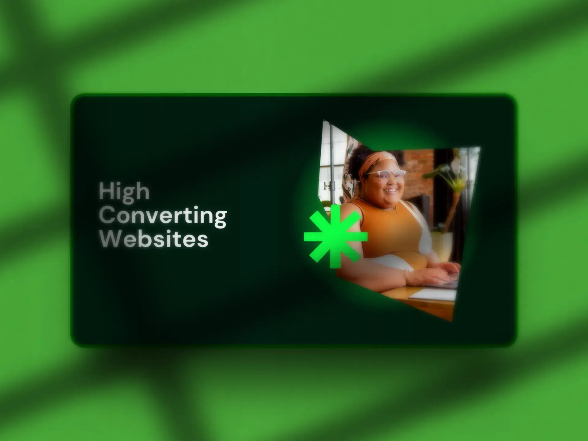
How to Build a High Converting Website in 2026
A guide that teaches you how to build a high converting website in 2026 with proven UX, design, and performance strategies that turn traffic into qualified leads and revenue.

Jason Atakhanov
April 13, 2026
How to Build a High Converting Website in 2026
Your ads are driving clicks, your SEO is starting to work, but your leads still feel like a trickle. If that sounds familiar, the issue isn’t your traffic. It’s that your site isn’t working like a high converting website yet. In 2026, with ad costs rising and attention spans shrinking, your website has to act like a top performing salesperson: fast, clear, and relentlessly focused on the next step.

In this guide, we’ll walk through what “high converting” actually means today, the benefits of getting it right, and a practical framework for building a B2B website that turns visits into pipeline instead of pageviews.
TL;DR
- Definition: A high converting website reliably turns qualified visits into pipeline, not just pageviews.
- Key benefits: More revenue from the same traffic, lower cost per lead, and better quality opportunities for sales.
- 7 building blocks: Clear value prop, mobile first UX, journey mapped pages, focused templates, frictionless forms, strong proof, and fast, technically sound performance.
- Next step: Benchmark your current conversion rates, fix the foundations, then iterate with targeted tests or a structured redesign.
What is a high converting website in 2026?
Let’s get clear on definitions. A “conversion” is the action that moves a visitor one step closer to revenue: a demo request, quote request, email subscription, program application, donation, or purchase.
Across industries, benchmark studies still find website and landing page conversion rates clustering in the low single digits, while top-performing experiences often hit double digits. Recent website conversion benchmarks from Unbounce, for example, put the average landing page conversion rate around 6–7%, with leaders significantly higher. B2B sites that sell complex services often see visitor-to-lead conversion rates closer to 1–3%, depending on traffic quality and offer.
So when we talk about a “high converting” website, we’re talking about a site that:
- Converts well above your current baseline (often +30–50% or more over time).
- Generates qualified leads or sales, not just form fills from mismatched visitors.
- Lets you scale ad spend and SEO confidently because the math works.
In other words: a high converting website is less about hitting a magic percentage and more about building a system that predictably turns traffic into pipeline.
If you’re not sure where you stand, start by benchmarking conversion rates on your key pages (home, core services, pricing, main lead magnets). Tools like GA4 and HubSpot, connected properly to your CRM, give you that baseline.
For a deeper overview of measurement, you can also read our guide on performance marketing metrics and ROI. Read the performance metrics guide.
The benefits of high converting website
Why put this much energy into conversion instead of “just” getting more traffic? Because a high converting site quietly compounds returns across your entire marketing budget.

1. More revenue from the same traffic
If your site gets 10,000 visits a month and converts at 1.5%, that’s 150 leads. Lift that to 3% and you’ve just doubled your lead volume without buying a single extra click.
2. Lower cost per lead and better ROAS
When your website does more of the sales work, performance channels like Google Ads, Meta, and programmatic campaigns stop feeling like a gamble and start looking like math, because every on site improvement makes your media buys more efficient.
3. Higher-quality opportunities
Conversion-focused websites don’t just collect more forms; they attract the right visitors, set the right expectations, and qualify people with smart UX and copy so your sales team gets more “we’re ready to talk” meetings and fewer “just browsing” inquiries.
4. A live testing lab for your messaging
A high converting site is built for experimentation A/B testing headlines, CTAs, offers, and page layouts so it becomes your best source of real-world customer language and proof.
If you want to see how we structure this across ads, content, and web, explore our ROI Framework.
Before you redesign: 5 foundations for conversion
The best-performing sites aren’t just pretty; they’re grounded in research. Before you sketch a single wireframe, get these pieces in place:
- Clear ICP and buyer roles. Who is the site really for? Write down your primary and secondary audiences (for example, municipal communications leaders, multi-location contractors, or Series B SaaS CMOs) and the jobs they’re hiring you to do.
- Value proposition and core promises. In one sentence: why you over every other option (including “do nothing”).
- Baseline data. Capture current conversion rates by page, device, and traffic source, plus lead-to-opportunity and close rates and average deal size so you can prove the site is working.
- Clear goals for each key page. For example: homepage → “Get Started” or “Request a Demo”; service pages → “Talk to sales” or “Book a consultation”; resource pages → “Download” or “Subscribe.”
- Analytics and CRM wiring. Make sure forms feed into your CRM, events are tagged correctly, and dashboards are set up before launch.
Skipping this step is how teams end up with beautiful brochure sites that quietly underperform.
If you’re mapping this out now, our team often bundles this research into a focused strategy sprint before web design (strategy sprints).
How to create a high converting B2B website: 7 building blocks
Whether you’re a municipality, a professional services firm, or a SaaS company, these principles apply to almost every high performing B2B site we build.
1. A five-second value proposition above the fold
If a stranger lands on your homepage, they should answer three questions in five seconds:
- What do you do?
- Who is it for?
- What outcome do you help them achieve?
A simple headline formula that works well:
“We help [ICP] get [outcome] without [major objection].”
Pair that with one primary CTA (for example “Get Started” or “Request a Demo”) and one secondary CTA (“View Case Studies” or “See Pricing”). Avoid cluttering the hero with three or four competing actions.
2. Simple, mobile-first UX and navigation
More than half of web traffic now comes from mobile, yet most studies show mobile conversion rates still meaningfully lower than desktop recent mobile conversion statistics from Google highlight just how much money slow, clunky experiences leave on the table. That means sloppy mobile UX is quietly burning a big chunk of your potential revenue.

- Keep your main navigation to 3 to 5 top level items.
- Use descriptive labels like “Services,” “Industries,” “Resources,” “About,” not internal jargon.
- Make your primary CTA button persistent on mobile (sticky in the header or bottom bar).
- Use generous spacing and readable font sizes; no tiny tap targets.
If you’re planning a rebuild, start design reviews on a mobile canvas, then expand to desktop. It’s much easier to translate a focused mobile experience up than to shave a crowded desktop layout down.
For more detail, we break down this approach in our guide to UX patterns.
3. Pages mapped to the real B2B buying journey
High converting B2B websites don’t just have “pages”; they have paths:
- Awareness: Blog articles, explainers, and resources that describe the problem better than the visitor can.
- Consideration: Service pages, industry pages, and comparison content that show how you solve it.
- Decision: Case studies, pricing, proposal request pages, and demo flows that make it easy to say yes.
Each stage should answer: Why change? Why you? Why now? Link these pages together intentionally. For example, a blog post about “website conversion benchmarks” should nudge people to a CRO or web audit offer, not dump them back at the homepage.
Want to see how this looks across a full funnel? Take a look at our full-funnel marketing overview.
4. Conversion focused page templates
A few page types do most of the heavy lifting on a high converting website:
- Homepage: Clear positioning, primary CTA, social proof, short overview of key services, and a path for new vs. returning visitors.
- Service / solution pages: Problem, stakes, your approach, process, proof, FAQs, and a strong “What happens next?” section.
- Campaign landing pages: One offer, one CTA, minimal navigation, focused copy, and supporting proof. These often outperform generic service pages by a wide margin.
Using a repeatable template system also lets your team ship new pages faster without rebuilding the strategy from scratch every time. That’s a key part of how we design HubSpot and WordPress sites at Setsail.
To see more on this, explore our website design & development services.
5. Forms that convert, not repel
Forms are where your hard won traffic either becomes a lead or disappears. Large scale benchmarks show overall form completion rates often hover around 50% and consistently trail off on mobile, with many users abandoning forms that feel long or confusing; recent form completion rate data from Zuko’s 2025 study highlights how much performance varies by industry and device.

A few practical rules:
- On first touch, ask for only what you need (name, email, company, and one qualifying question are often enough).
- Use multi step or “conversational” forms for more complex asks instead of one intimidating wall of fields.
- Make your button copy specific: “Request my demo,” “Send me the proposal,” not just “Submit.”
Studies show that forms with fewer than five fields can materially increase submission rates compared to longer forms, especially on mobile.
Behind the scenes, every form should push cleanly into your CRM and workflows so your team can follow up fast and track revenue back to specific pages and campaigns.
We unpack this in more depth in our article on high-performing lead gen forms.
6. Proof that your solution works
In B2B and public sector work especially, risk is a bigger blocker than price. Your website needs to show, not just tell, that you can deliver.
- Case studies that highlight outcomes (conversion lifts, cost savings, program participation, safety improvements).
- Logos from recognizable clients and municipalities.
- Short testimonial quotes near key CTAs, not buried on a separate page.
- Trust signals like certifications, media mentions, and B Corp status where relevant.
Case in point: Baymard checkout research finds the average cart abandonment rate still around 70%, and estimates that improving checkout UX alone can lift conversion by roughly 35% for large ecommerce sites. The same principle holds in lead generation strong UX plus strong proof moves the needle.
To see how we present proof, browse our client case studies.
7. Speed, SEO, and technical hygiene
No matter how good your copy is, a slow or unstable site will leak conversions. Google’s research into the load time impact on conversion has shown that, in retail, a one‑second delay in mobile page load can reduce conversion rates by up to 20%.
- Keep Core Web Vitals healthy: fast load, stable layout, responsive interaction.
- Compress and properly size media; avoid heavy third party scripts you don’t truly need.
- Use clear H1/H2 structure, descriptive title tags, and internal links that help both users and search engines.
- Make sure tracking scripts, forms, and consent tools are implemented cleanly so you’re not flying blind on performance.
For more on the SEO side of this, see our SEO services overview.
Practical checklist: is your website built to convert?
Use this quick pass to spot easy wins. If you answer “no” to several of these, there’s real upside on the table.
- Can a new visitor understand what you do, who it’s for, and the next step in under 5 seconds?
- Does every key page have one primary CTA that matches its role in the funnel?
- Are your forms short, mobile-friendly, and connected to your CRM?
- Do you have at least 2–3 strong case studies or success stories visible from the homepage?
- Is your average page load time under 3 seconds on mobile?
- Can you see conversion rates by page, by device, and by traffic source in a single dashboard?
- Have you run at least one A/B test on headlines, CTAs, or layouts in the last 90 days?
If this checklist feels like a stretch, you’re exactly the kind of team that benefits from a structured web overhaul instead of more surface-level tweaks.
For a deeper step‑by‑step, grab our website redesign checklist.
What to measure once your new site goes live
A high converting website isn’t a one and done project. Launch is the starting line. Here’s what we encourage clients to track in the first 90 days:
- Overall conversion rate for your primary goal (demo, quote, application, etc.).
- Conversion by key page (home, top services, pricing, core landing pages).
- Conversion by device so you can spot mobile-specific issues fast.
- Lead quality: MQL → SQL → opportunity → closed‑won.
- Revenue influenced by web: how many deals touched the site on the way to close.
From there, pick one variable at a time to test: a headline, supporting proof, button copy, or form length. High converting sites are usually the ones where teams keep testing small changes against clear baselines instead of doing a full redesign every two years and hoping for the best.
If you’re not sure what to test first, our intro to conversion rate optimization lays out a simple testing sequence.
When to bring in a conversion-focused partner
You don’t need an agency for every landing page. But there are moments when outside help is the fastest path to a high converting website:
- You’re investing seriously in PPC, SEO, or media but your site can’t keep up.
- Your stakeholders want a “rebrand,” but nobody has defined what success looks like in hard numbers.
- You have multiple audiences (for example, citizens and internal teams, or B2B and channel partners) and your current site confuses all of them.
- Your team is strong in content or dev, but not both, so projects stall in the handoff.
At Setsail, strategy, creative, web, and media buying live under one roof, so new sites plug directly into your ROI framework and you can see the impact on leads and revenue, not just on-page metrics. We usually start with a focused website and funnel audit, then map the highest‑impact changes into a fixed‑timeline, fixed‑deliverable build.
FAQ: Building a high converting website in 2026
What is a good website conversion rate for B2B in 2026?
Many B2B websites convert visitors to leads somewhere in the 1–3% range, with top performers reaching 5%+ depending on offer, traffic quality, and industry. Rather than chasing an industry average, benchmark your own site today and set a realistic improvement target over the next 6–12 months (for example, +30–50% lift).
How long does it take to build a high converting website?
For most mid market organizations, we see full projects (strategy, UX, design, development, content, and launch) land in the 8–12 week range, depending on scope and how quickly content and approvals move. Conversion gains typically show up in the first 30–90 days after launch as you refine messaging and fix any friction points.
Do we have to rebuild the whole site, or can we optimize what we have?
Not every organization needs a full rebuild. If your brand, tech stack, and information architecture are solid, you can often get meaningful lifts by reworking key templates, tightening messaging, improving forms, and adding proof. Part of our audit process is helping you decide whether focused optimization or a full redesign will deliver the best ROI.
If you’d like help figuring that out, contact our team and we’ll share what we’d prioritize first.
Key takeaways
- A high converting website is one that reliably turns qualified visits into pipeline by focusing every page and CTA on the next best step.
- The 7 building blocks clear value proposition, mobile first UX, journey mapped pages, focused templates, frictionless forms, strong proof, and fast, technically sound performance work together to lift conversion.
- Measure conversion by page, device, and source, then keep iterating with focused tests instead of waiting for the next big redesign.
Jason Atakhanov
April 13, 2026
Recent Posts:
How Much Does Website Design Cost in 2026?
Discover how much does website design cost in 2026 and what businesses should expect to pay for professional website design services with impacts.
Inbound Marketing: How Much Should You Invest?
Discover how inbound marketing budgets work, what influences costs, and how to invest effectively for long term ROI and sustainable growth.
How Much Do Email Marketing Services Cost in 2026?
Explore email marketing cost in 2026 and understand how investment levels influence performance, list growth, and long term revenue impact.