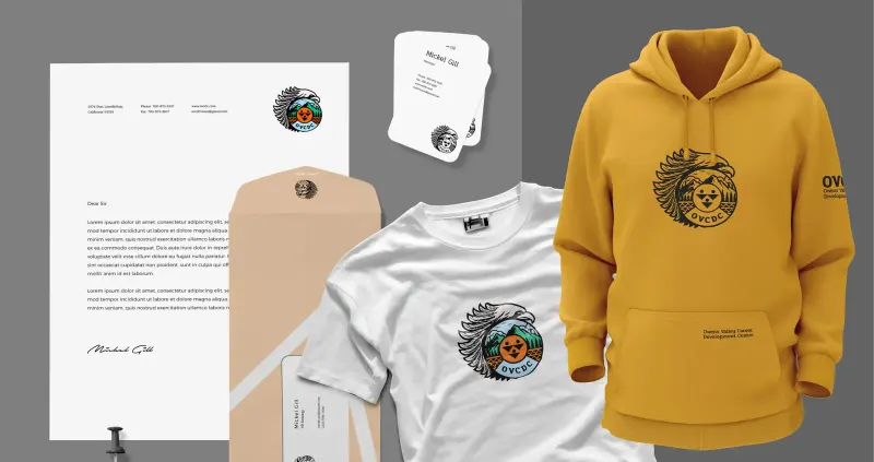
Community-Led Visual Identity Design for Owens Valley Career Development Center
Our work for Owens Valley, California
Owens Valley Career Development Center needed a visual identity that reflected its Indigenous heritage and worked across its education, career-development and support programmes in California. We developed the brand through interviews and feedback sessions with elders, youth, directors and staff. The resulting identity and toolkit covered digital, print, merchandise and ceremonial applications. Reported outcomes included 85% higher community engagement, a 75% increase in recognition and 65% more programme sign-ups, alongside the team’s use of shared templates and guidance.
Community input throughout the identity work
We held workshops with tribal elders, youth and programme staff to understand what the identity needed to represent. Their input informed the design and successive revisions. Every stakeholder involved approved the final direction after those revisions.
A flexible visual system for OVCDC programmes
The visual system drew on the cultural references raised through research and feedback. It was prepared for print, digital and signage, with a reported 75% increase in recognition within three months after the rebrand.
Templates and guidance for staff and partners
We developed assets for explaining OVCDC’s services and promoting its programmes. Staff could apply the same identity across their materials. Reported results included 65% more programme sign-ups and increased community engagement after the launch.
A visual identity developed with OVCDC’s community
Context & Challenge
Owens Valley Career Development Center (OVCDC) provides career development, education and support services for Native American communities in Owens Valley, California. Its existing brand needed to reflect both that work and its Indigenous heritage. The identity had to serve different programmes while representing the community in a way its members recognized.
The identity needed to work for elders, youth and staff across programmes ranging from workforce development to wellness. We needed to understand the cultural references and practical applications together, so the design could be respectful of its context and useful in everyday communications.
The design needed to be developed with community input. The identity would represent people of different generations and support several programmes, so interviews and feedback sessions were part of the process before the final visual direction was agreed.
Approach & Strategy
Through our Vision Mapping process, we interviewed tribal elders, directors and youth about OVCDC’s history, mission and future. Those conversations supplied the stories and cultural references for the initial design directions, with community feedback used to check their interpretation.
The conversations focused on the values and experiences people wanted the identity to represent. That input gave us a basis for reviewing the visual directions, including where a symbol had meaning and where an idea needed to change before it could be used.
From a service perspective, this work combined several of our core offerings:
- Visual Identity Design
- Nonprofit Branding Strategy
- Community Engagement Campaigns
- Creative Asset Development

We also reviewed other Indigenous branding examples and case studies from across North America, carefully noting what felt authentic and what missed the mark. This helped us avoid clichés or one-dimensional symbols, and instead guided us toward a layered, respectful design system.
Creative Process
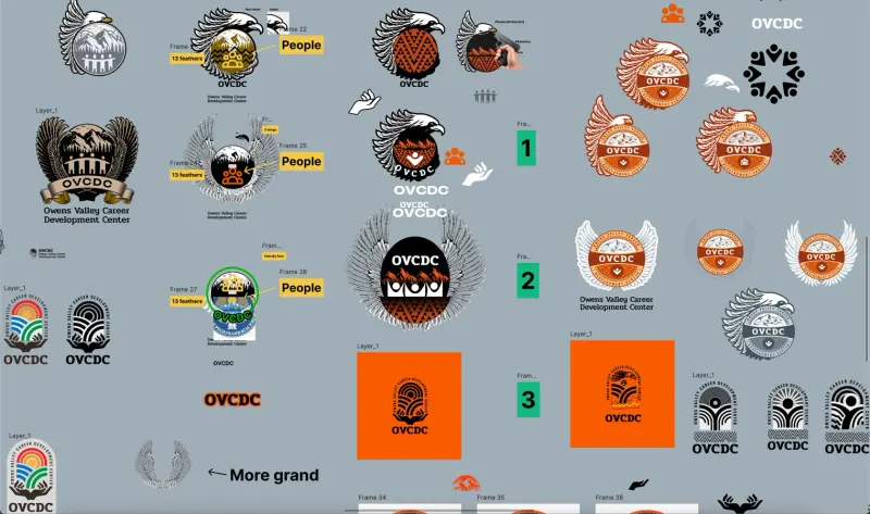
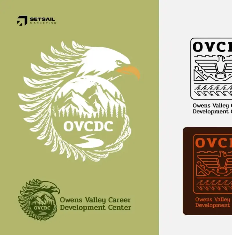
We developed three initial directions using references from the research, including traditional basket-weaving patterns, regional landmarks, animal symbolism and sun/moon iconography. Each direction provided a way to discuss the relationship between those references and the organization’s current communications needs.
We reviewed the directions with OVCDC’s stakeholders in live feedback sessions. Elders explained what each design meant to them, and we adjusted the work in response. The sessions let people discuss the meanings directly as the visual direction developed.
The feedback sessions gave community members a direct role in reviewing what the design represented. We used their responses to revise the concepts, rather than treating the first presentation as a finished answer.
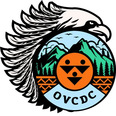
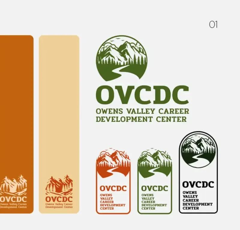
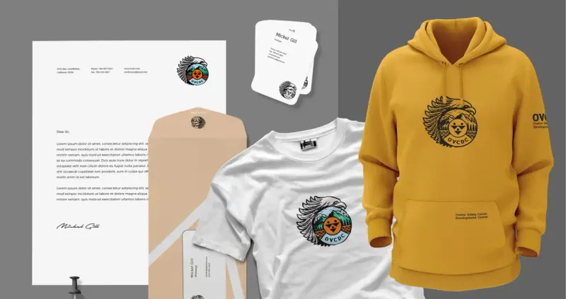
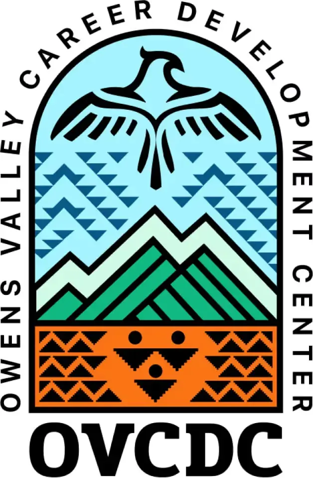
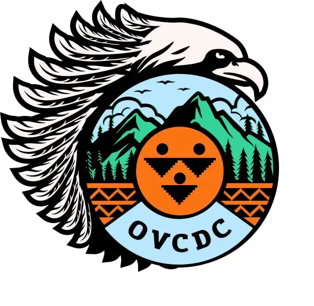
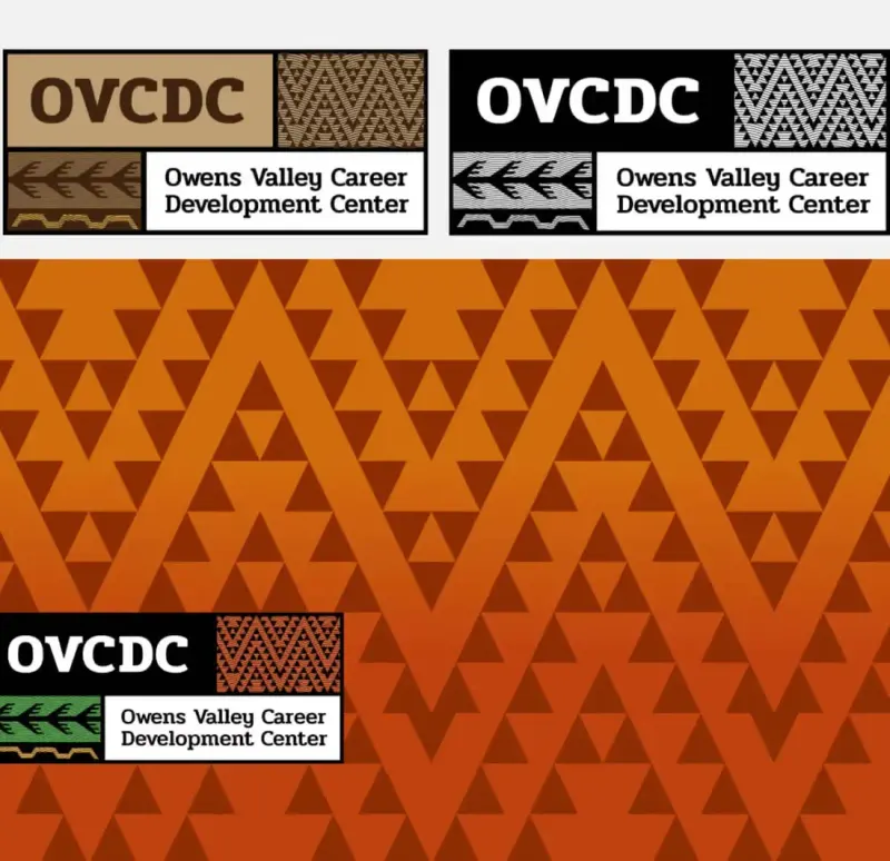
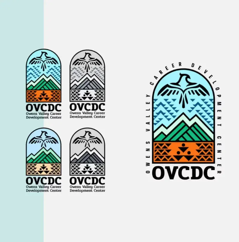
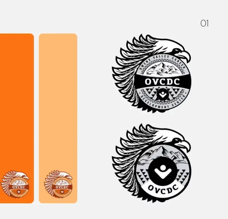
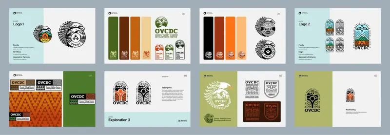
The final identity used a refreshed tribal crest representing mountains, pathways, water and the unity of generations. Clear typography supported its use across different applications. We paired the agreed design with guidance and assets the team could use in its routine communications.
We paired this with a robust visual toolkit:
- A full colour system drawn from nature
- Custom iconography for departments
- Pattern sets inspired by local craft traditions
- Clear brand usage guidelines for internal and partner use
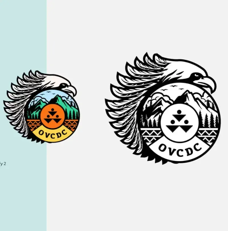
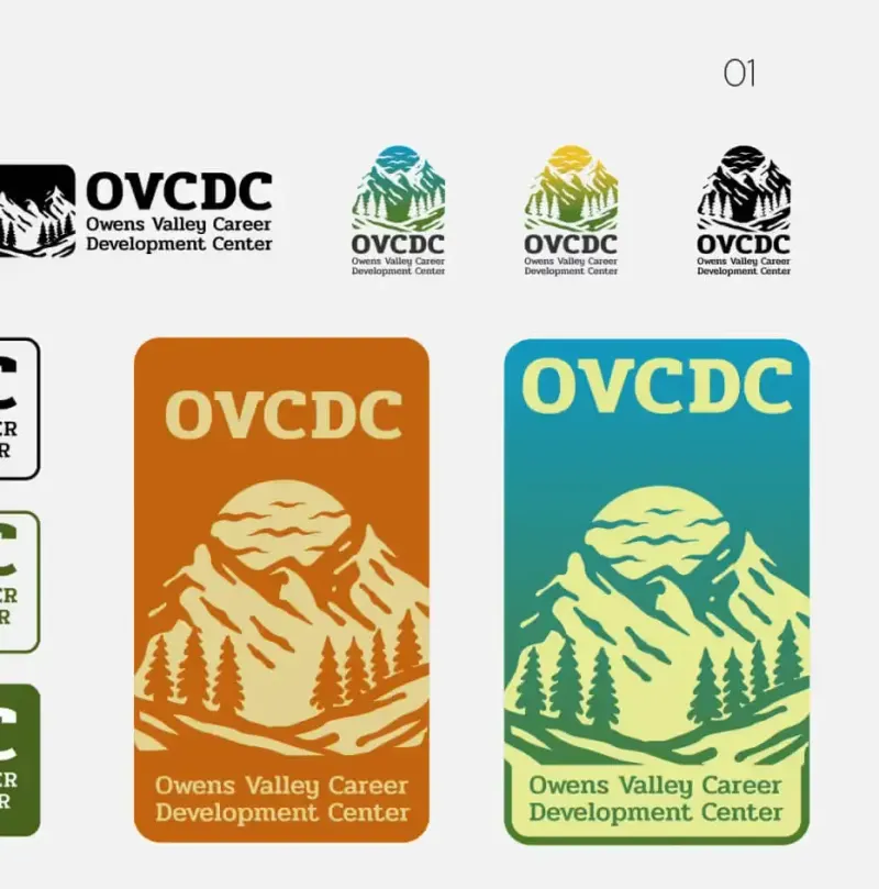
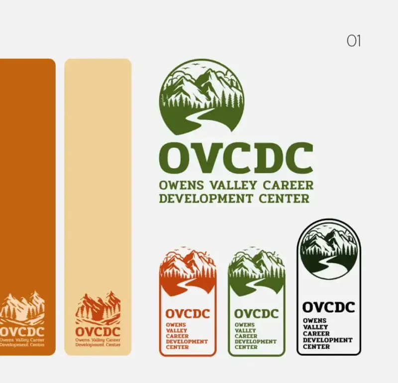
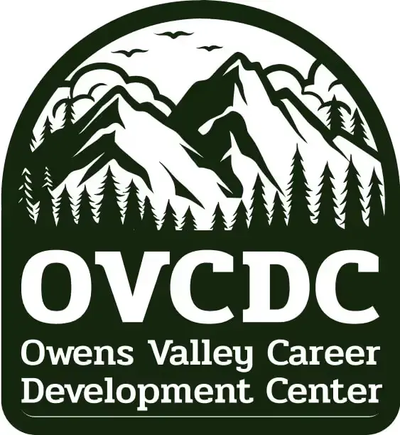
Execution & Deliverables
The delivery needed to make the identity practical for staff and partners. We prepared the files, templates and guidance around the uses identified during the project, so the system could be applied consistently after the design work ended.
We delivered a complete nonprofit visual identity system, including:
- Primary and secondary logo formats
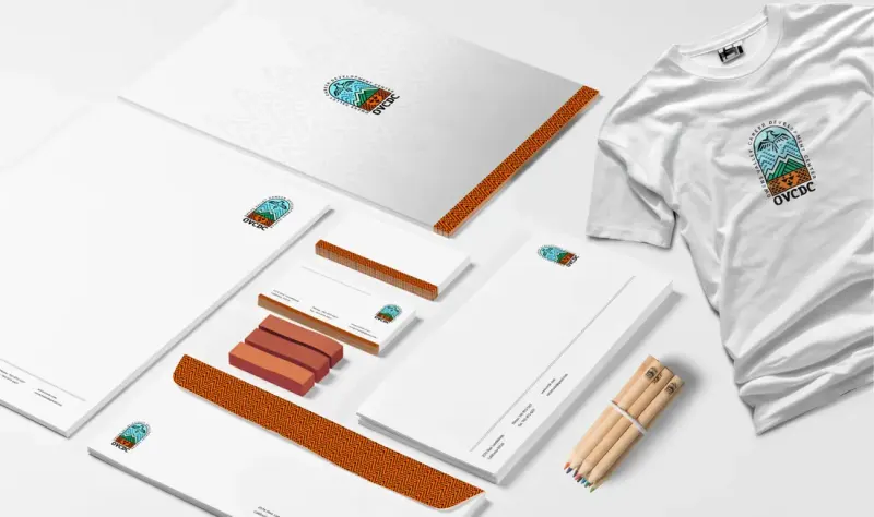
- Branded templates for reports, signs, and social media
- A brand guidelines document
- Asset packages for print, digital, and merchandise
- Ceremony-ready applications (including drum decals and staff apparel)
We hosted a remote workshop for the internal team, covering applications from HR documents to community event signage. Staff could work through the tools and guidance with us, then use the editable files within their own production process.
Tangible Outcomes
Reported outcomes after the rebrand included changes in engagement, recognition and programme participation:
Engagement
- Community engagement rose by 85% across OVCDC’s programs
- Elders, staff, and youth reported a stronger emotional connection to the organization
- Tribal representatives shared that the brand “felt like home” and reflected the pride they wanted to see
Recognition
- Brand recognition increased by 75% within 3 months
- Social media impressions improved due to consistent design and recognizability
- Community events saw record attendance post-rebrand
Participation
- Program sign-ups increased by 65%
- Internal departments more confidently promoted services using the new templates
- External partners began using the branded assets, extending the visual system’s reach
Lessons Learned & What’s Next
The design process depended on input from the people the identity represented. Interviews and feedback sessions gave us specific references to work with and a way to check their use. The final toolkit then translated that agreed direction into applications for staff, programmes and partners.
If you’re a nonprofit or Indigenous organization looking to clarify your message, modernize your visual identity, or reconnect with your audience, our team would be honoured to help.
The identity gave OVCDC a common set of visual tools for its existing services and future communications. Its ongoing use would depend on the staff and partners applying the system, which is why editable files, guidelines and training formed part of the project.
Ready to Build Your Own Community-Led Brand?
Explore our branding services or book a strategy call to start your project.
Project FAQs
How does visual identity design support Indigenous nonprofit organizations?
Visual identity design helps Indigenous nonprofits like OVCDC visually communicate their mission, values, and cultural heritage. It builds community trust, improves recognition, and strengthens engagement across generations. A well-designed identity also makes internal communication and external outreach more consistent and effective.
What makes community-led branding different from traditional design?
Community-led branding involves direct collaboration with stakeholders at every stage. Instead of making assumptions, the process gathers real input from elders, youth, and leadership. This ensures the final brand reflects authentic cultural values and achieves full buy-in from the people it represents.
How can a nonprofit branding strategy improve engagement?
A nonprofit brand system can make programmes and service information easier to recognize across different materials. OVCDC reported higher engagement and participation after its rebrand, including an 85% engagement increase and 65% more sign-ups. Those are the reported project outcomes, rather than a result another organization should assume from design alone.
What does a nonprofit visual identity system include?
A complete visual identity system includes logos, colour palettes, typography, brand guidelines, and templates for digital and print use. For OVCDC, it also included ceremonial applications, cultural symbols, and multi-platform assets tailored to their programs and communication needs.
How do I get started with Setsail Marketing?
Book a Growth Strategy call with Setsail Marketing to discuss your organization, community and communications needs. We can review the people who need to be involved, the existing identity and the applications required, then plan the research, design and rollout work.