Municipal Graphic Design System for the City of Coquitlam

Our work for City of Coquitlam – Brand & Design Support
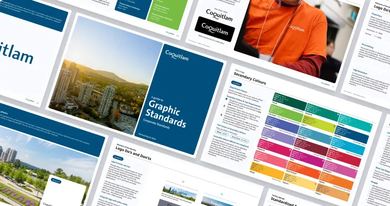
The City of Coquitlam had an established visual identity, but its departments were applying it differently across reports and public materials. We audited the existing documents and built a shared design system for strategic plans, business reports and community communications. Reusable layouts, updated assets and guidance gave the in-house team a more consistent starting point. The work included editable templates in the tools staff already used, alongside training and an online brand reference to support the rollout across departments.
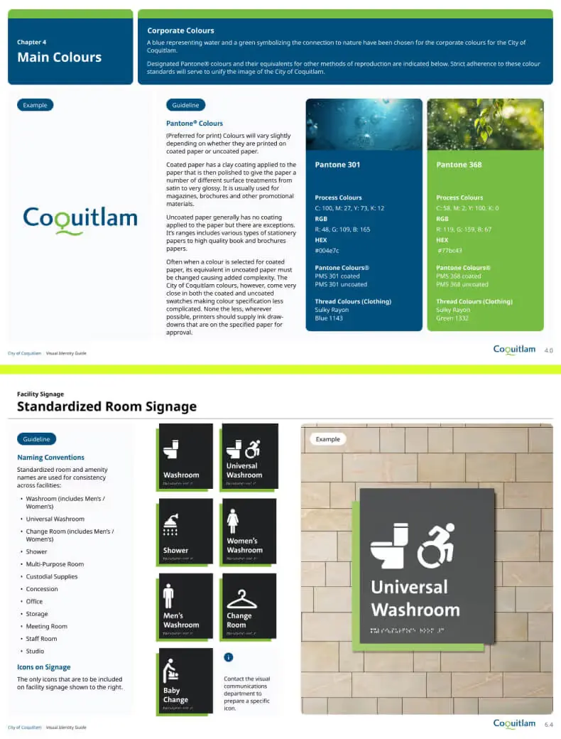
Templates for recurring municipal documents
We developed templates for the reports and plans the city produced regularly. Consistent page structures and reusable content blocks reduced the amount of formatting staff had to repeat, while keeping the documents aligned with the existing brand.
Organized brand assets and layout rules
We defined colour, typography, spacing and layout standards in one system. This gave designers and departmental staff a shared reference when creating materials, helping reduce inconsistent interpretations and the rework they caused.
Editable tools for the in-house team
The tools were delivered in formats staff already used, including design files and templates for non-designers. Training and guidance supported the team in producing its own documents instead of relying on outside design support for each update.
Making Coquitlam’s existing brand easier to use
Context & Challenge
The City of Coquitlam’s core visual identity was established, but its application varied between departments. Teams had adapted the guidelines over time, creating different approaches to documents, signage and other public communications. We needed to bring those materials back into one usable system while working with the brand already in place.
The City Business Plan, Strategic Plan, and Emergency Preparedness Reports had different visual structures and could be difficult to navigate. Designers lacked a central set of tools, while readers encountered inconsistent layouts. The brief concerned both sides of that problem: how staff made the documents and how residents and stakeholders used them.
The challenge wasn’t to invent something new. It was to organize and optimize what already existed, then build scalable tools the in-house team could use for years to come.
Approach & Strategy
We audited over 40 document types from several departments, reviewing their formats, template variations and production processes. The city already had a visual identity. What staff needed was a more accessible system for applying it consistently as they created and updated their materials.
We framed the project in three stages:
- Design System Audit & Discovery
We collected live files and historical templates from various city teams. This helped us map which design elements were working, which were misaligned, and where consistency broke down. - System Strategy & Prioritization
We worked with the City’s Communications Department to define the highest-impact materials. Strategic Plans, Business Plans, and branded frameworks for department-level content rose to the top. - Scalable System Development
Instead of reinventing the brand, we created a design system to extend it: flexible layouts, organized templates, and clear usage guidelines. The goal was to reduce rework, speed up internal production, and apply the city’s brand consistently across its materials.
Creative Process
Working sessions with Coquitlam’s in-house team showed where production slowed down. Staff described reformatting charts, making typography decisions without a shared hierarchy and recreating layouts from memory. We used those examples to decide which templates and content blocks would be most useful, rather than designing a guide in isolation from the team’s work.
Our UX/UI design team developed adaptable content blocks for Coquitlam’s varied material. The system had to accommodate dense legislative information, higher-level strategy and community visuals, with a structure that could remain recognizable as the content changed.

In parallel, our graphic design team worked to clean up the city’s visual assets. We reviewed font treatments, adjusted colour accessibility, and refined spacing standards to ensure consistency across digital and print.
We treated every document type like a product: What does success look like? Who’s using it? What’s the experience of reading this on a desktop vs. in a printed binder?
The system was designed for the city’s working requirements. It needed to remain clear in both digital documents and printed reports, support accessible colour and typography choices, and give staff enough flexibility to handle the range of municipal content.

Execution & Deliverables
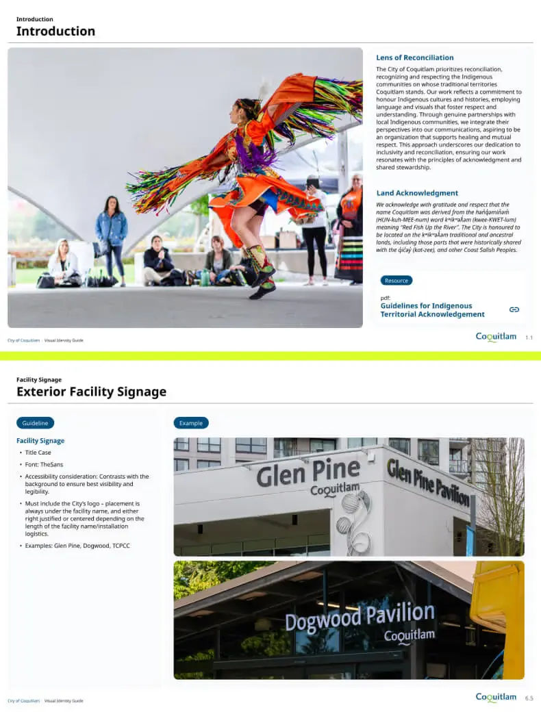
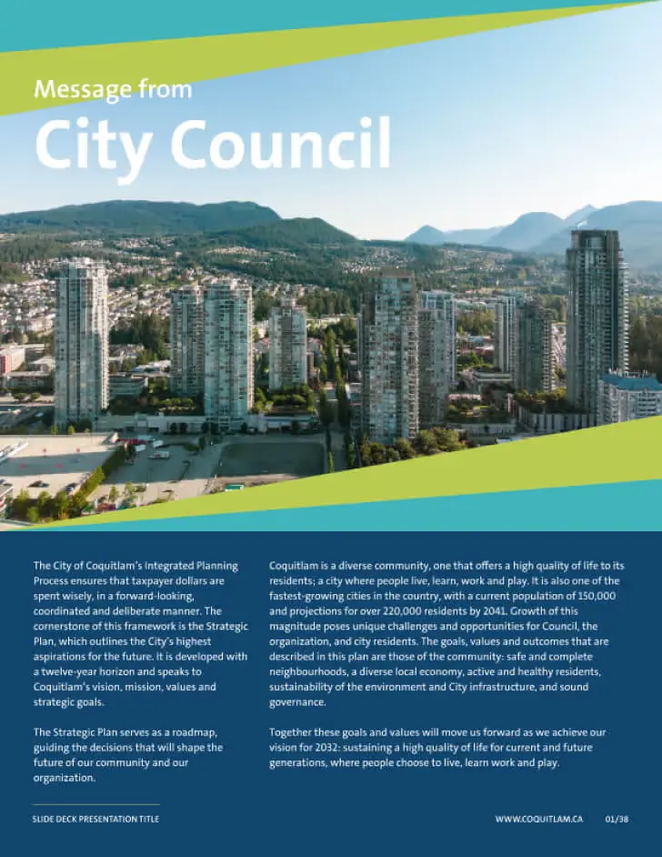
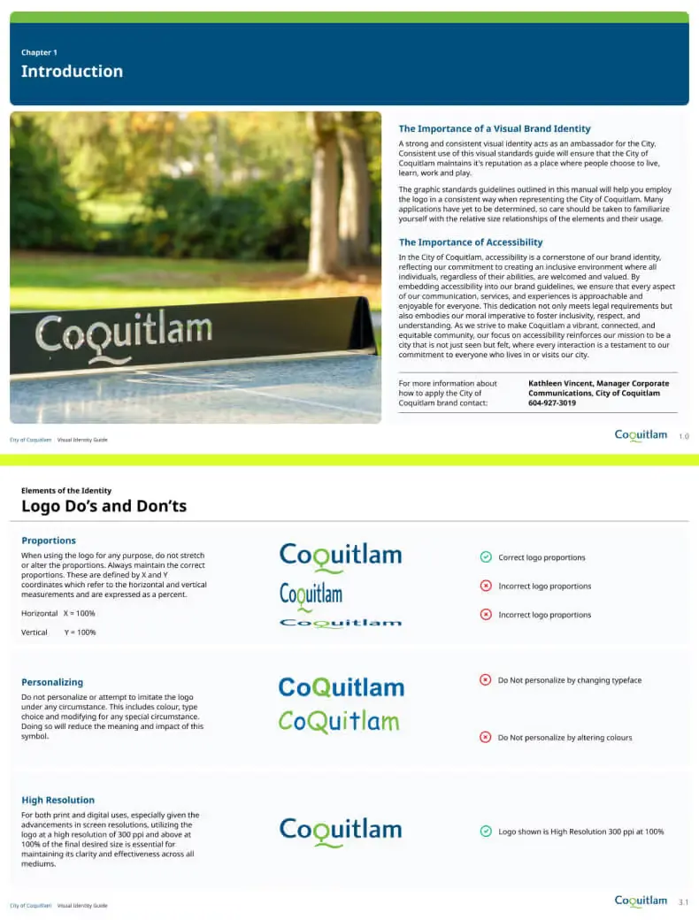
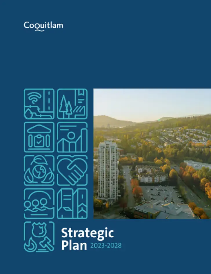
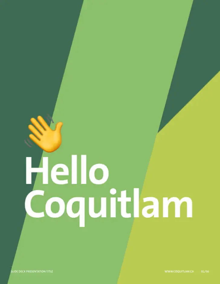
We delivered modular tools alongside the brand guidance. The templates and content blocks were intended for recurring use, so staff could apply the same design decisions across new documents instead of recreating the layout for every report.
Key deliverables included:
- A full design system for strategic municipal documents, including layout grids, text hierarchies, and content modules.
- Custom designs for:
- City of Coquitlam Business Plan
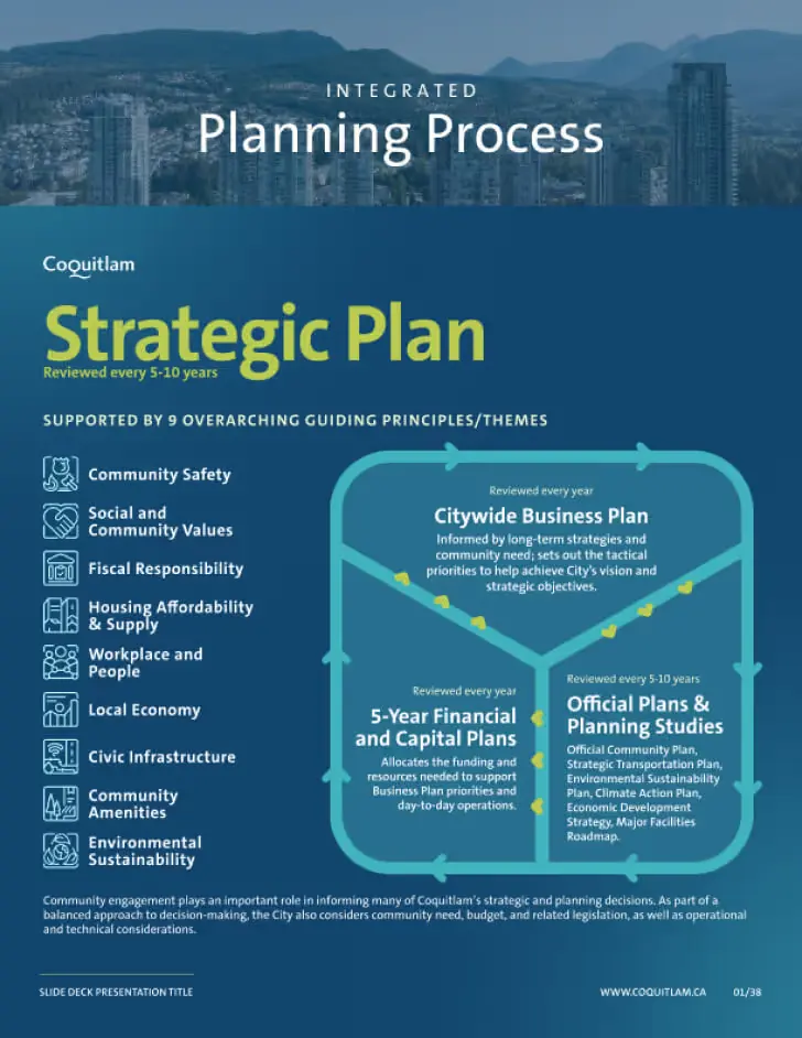
- City of Coquitlam Strategic Plan
- City of Coquitlam Council Reports
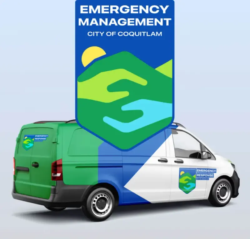
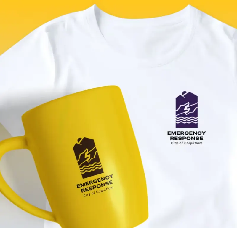
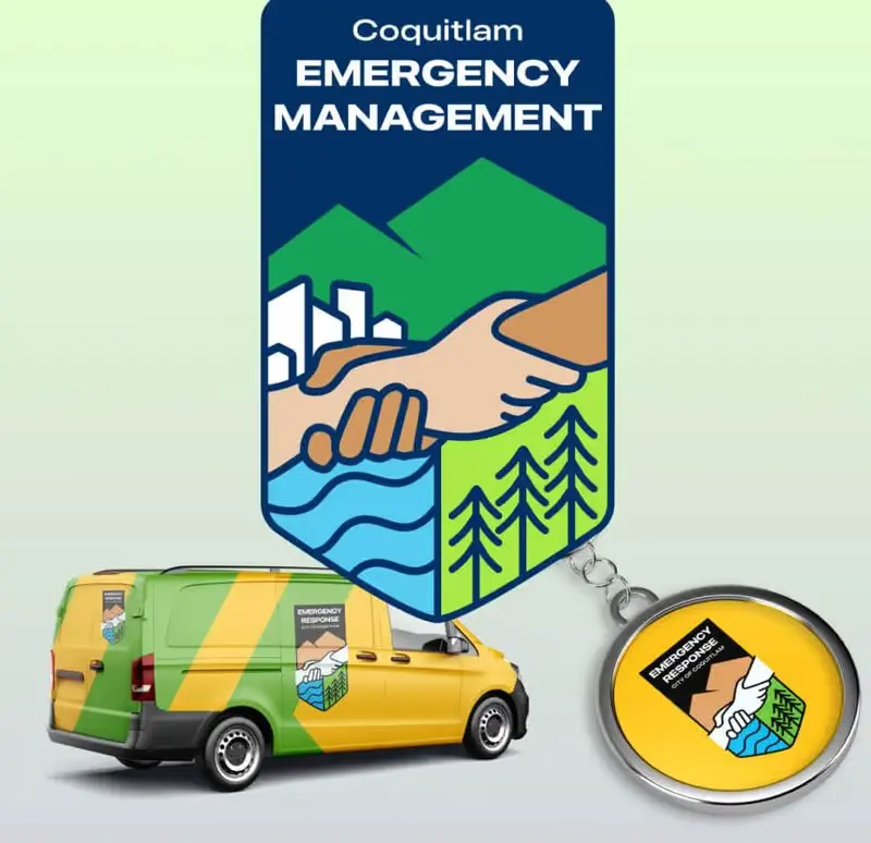
- City of Coquitlam Emergency Response Materials
- Branded graphic elements for signage, apparel, and promotional items
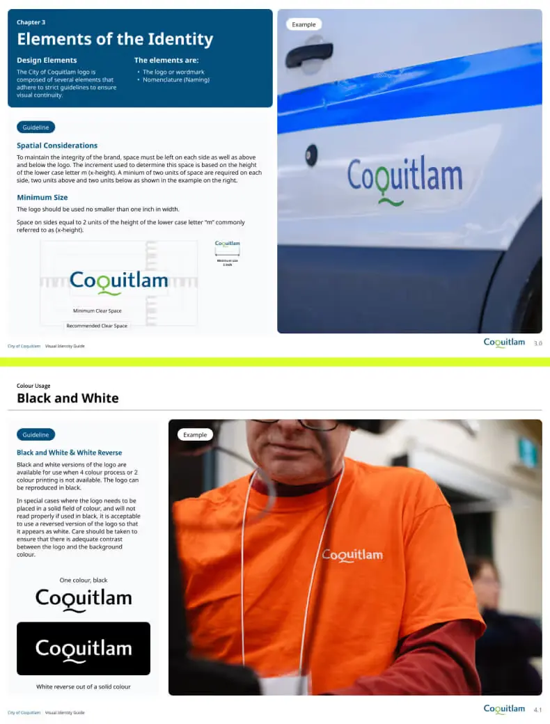
- Updated brand guideline assets to reflect the new design logic
- A collaborative rollout strategy to integrate templates into the city's internal design workflows
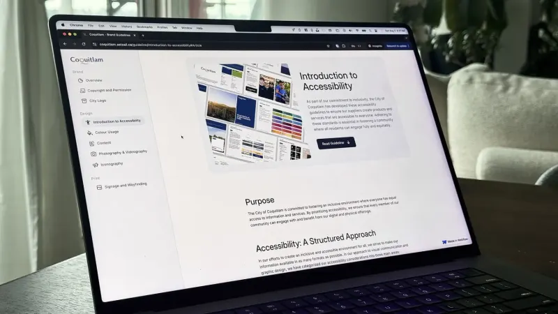
We delivered files in the tools staff used: Figma & InDesign for designers, PowerPoint and Word templates for other teams, and editable Illustrator files for signage. The shared brand reference is available at https://coquitlam.setsail.ca/.
We also developed training resources and hosted knowledge-transfer sessions with staff to ensure smooth adoption.
Tangible Outcomes
While brand equity and consistency aren’t always easy to quantify, this project delivered both measurable results and long-term operational benefits.
Highlights:
- Reduced document production time by an estimated 40–60% for internal teams
- Created 10+ reusable templates for recurring municipal documents
- Increased visual consistency across 8+ departments
- Delivered a scalable design system that works across print, web, and signage
Lessons Learned & What’s Next
Municipal design has to account for several departments, established tools and accessibility requirements. The Coquitlam project focused on design systems for recurring work, making the existing identity more practical to apply across the material staff produced each week.
We organized the existing identity into reusable tools. Staff could retain the city’s brand while using clearer layouts for routine work. The time savings were estimated, alongside the reported template and department counts.
Our next steps with the city include:
- Exploring digital templates for web-based reporting
- Extending the design system to event signage and advertising
- Supporting additional departments as they adopt the framework
The system gave staff common files, layouts and guidance for day-to-day communications. Editable formats, training and the online brand reference supported its continued use as departments prepared new reports and updated existing documents.
Project FAQs
How do municipal design systems improve internal workflows?
Design systems bring structure to government communications. For municipalities like Coquitlam, a centralized design system reduced production time, aligned internal teams, and helped departments maintain consistent visual standards across all public documents without needing to recreate assets from scratch.
What branding services are most effective for cities and local governments?
The most impactful branding services for cities include visual identity optimization, scalable document templates, signage systems, and updated brand guidelines. These tools ensure every department can communicate clearly and consistently while reflecting the city's core values.
How does Setsail Marketing approach government and public sector design?
We focus on scalable systems over one-off designs. For government clients, that means building reusable templates, accessible layouts, and clear design logic. Our process is collaborative, fast-moving, and designed to reduce friction for in-house teams.
What were the results of the City of Coquitlam branding project?
The project delivered 10+ reusable templates across 8+ departments, with an estimated 40–60% reduction in document production time. The files, shared brand reference and training gave staff a more consistent way to prepare strategic plans, public reports and other recurring materials.
How do I get started with Setsail Marketing for my municipal project?
Book a Growth Strategy call with Setsail Marketing to discuss your municipal design project. We’ll review the existing identity, document types, departments and tools involved, then identify the design-system and rollout work your team needs.