


City Branding – How Rebranding Boosted Community Trust and Engagement in Santa Cruz
The City of Santa Cruz transformed public perception with a rebranding strategy that revitalized its brand identity and communications. Our team led the city branding project, delivering a new logo, messaging, and marketing strategy aligned with community values. The result: higher engagement, stronger trust, and a cohesive municipal brand. Explore how strategic rebranding created lasting impact — and see what a clear brand strategy can do for your organization.


How Our Digital Marketing Agency Drove Growth

Rebranding Strategy that Built Community Trust
The city lacked a unified identity. We conducted stakeholder research, then designed a rebranding strategy that aligned vision and values. The result was a trusted brand that residents and visitors recognized across every channel.
Brand Identity Design that Unified Communications
Santa Cruz needed consistency. We developed a citywide brand toolkit — logo, typography, and messaging. This brand identity design ensured all departments communicated clearly, strengthening recognition and confidence in city services.
Marketing Strategy that Drove Engagement
Community engagement was fragmented. We created a marketing strategy spanning digital and traditional channels. The plan amplified brand messaging, improved visibility, and generated measurable increases in awareness and participation across the city.

Rebranding that unified communications and earned trust
Context & Challenge
When the City of Santa Cruz issued an RFP for Communications and Rebranding Services, they were clear about the mandate: revitalise the municipal brand, standardise communications, and deliver a toolkit that every department could use with confidence. The brief called for market research, a full brand strategy, brand identity (including logo redesign options), and a communication plan spanning traditional and digital channels—plus project management from kickoff to closeout.
As a branding agency that specialises in high-stakes public work, we saw a familiar pattern: multiple departments communicating well-intentioned messages without a unifying brand identity. The outcome was inconsistent city branding, diluted trust, and missed opportunities to activate residents, businesses, and visitors. Our challenge was to create a credible rebranding strategy that aligned leadership, staff, and community—without losing the city’s history or spirit.
Approach / Strategy
We anchored the engagement in four tracks that mirrored the City’s RFP scope:
- Market research & insight. We designed a research plan to map audiences, sentiment, and message clarity, combining desk research, staff workshops, and resident input (surveys and intercepts). The goal: evidence for decision-making, not opinions.
- Brand strategy. We defined purpose, values, personality, positioning, and a citywide narrative that could flex from public safety to tourism. A usable brand strategy turns into better day-to-day marketing strategy; that’s how we designed it.
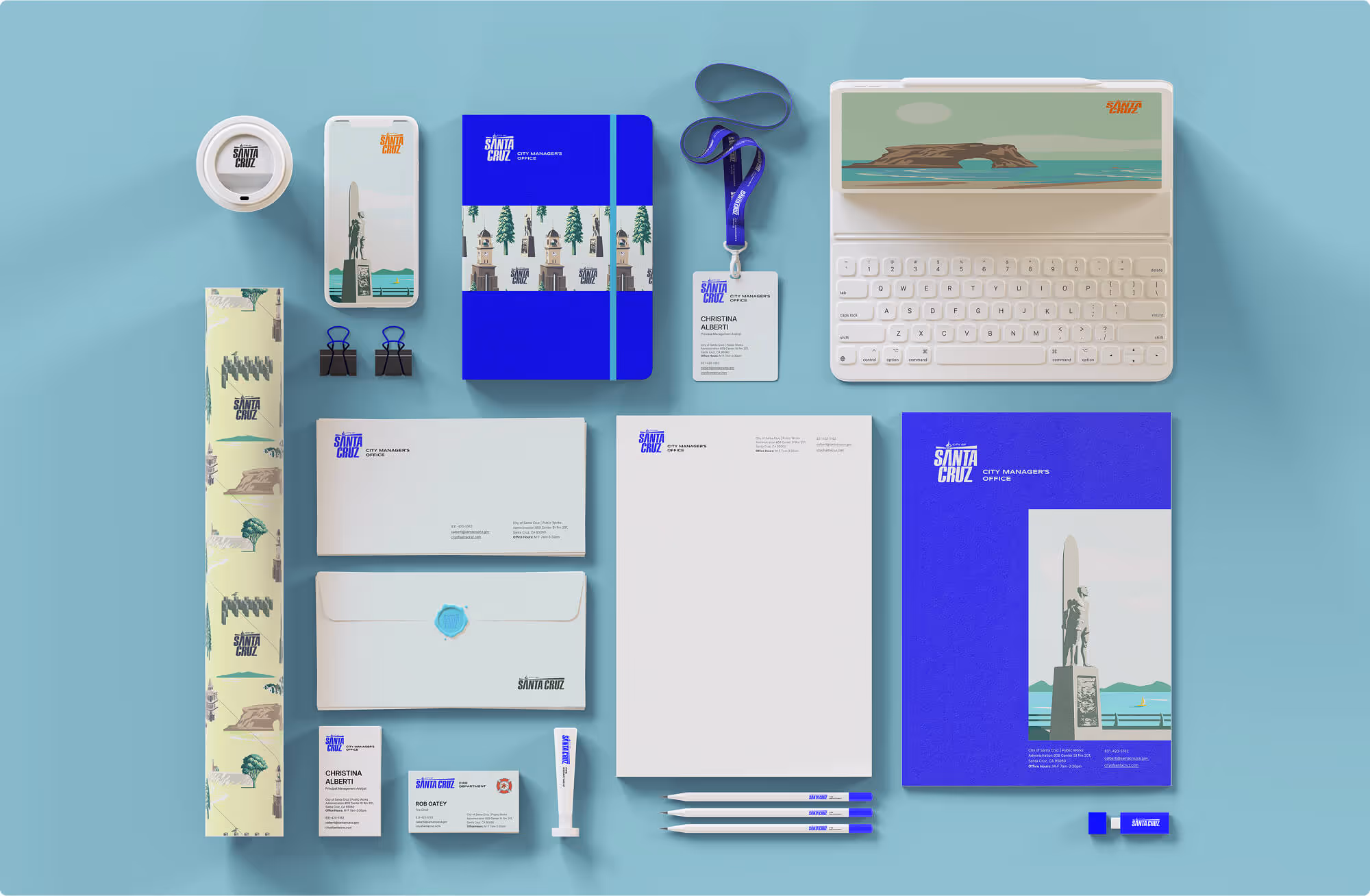
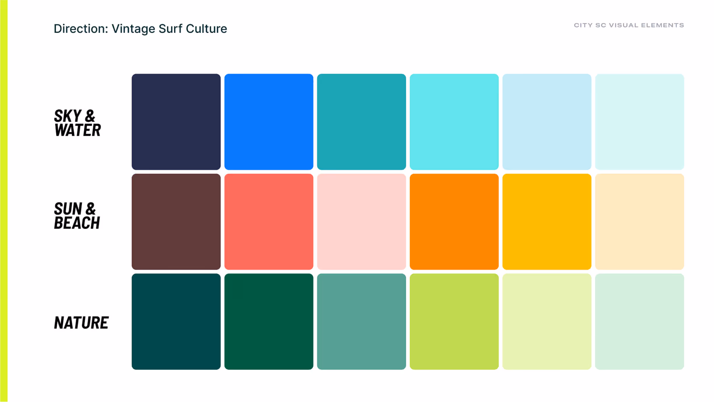
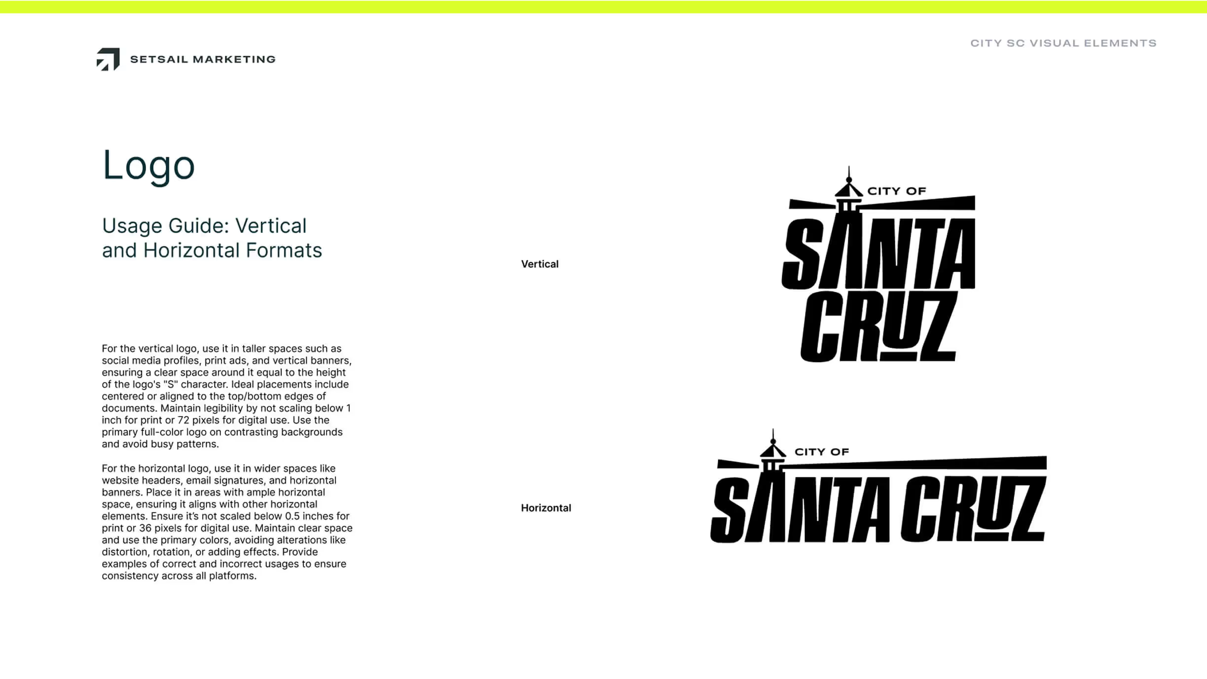
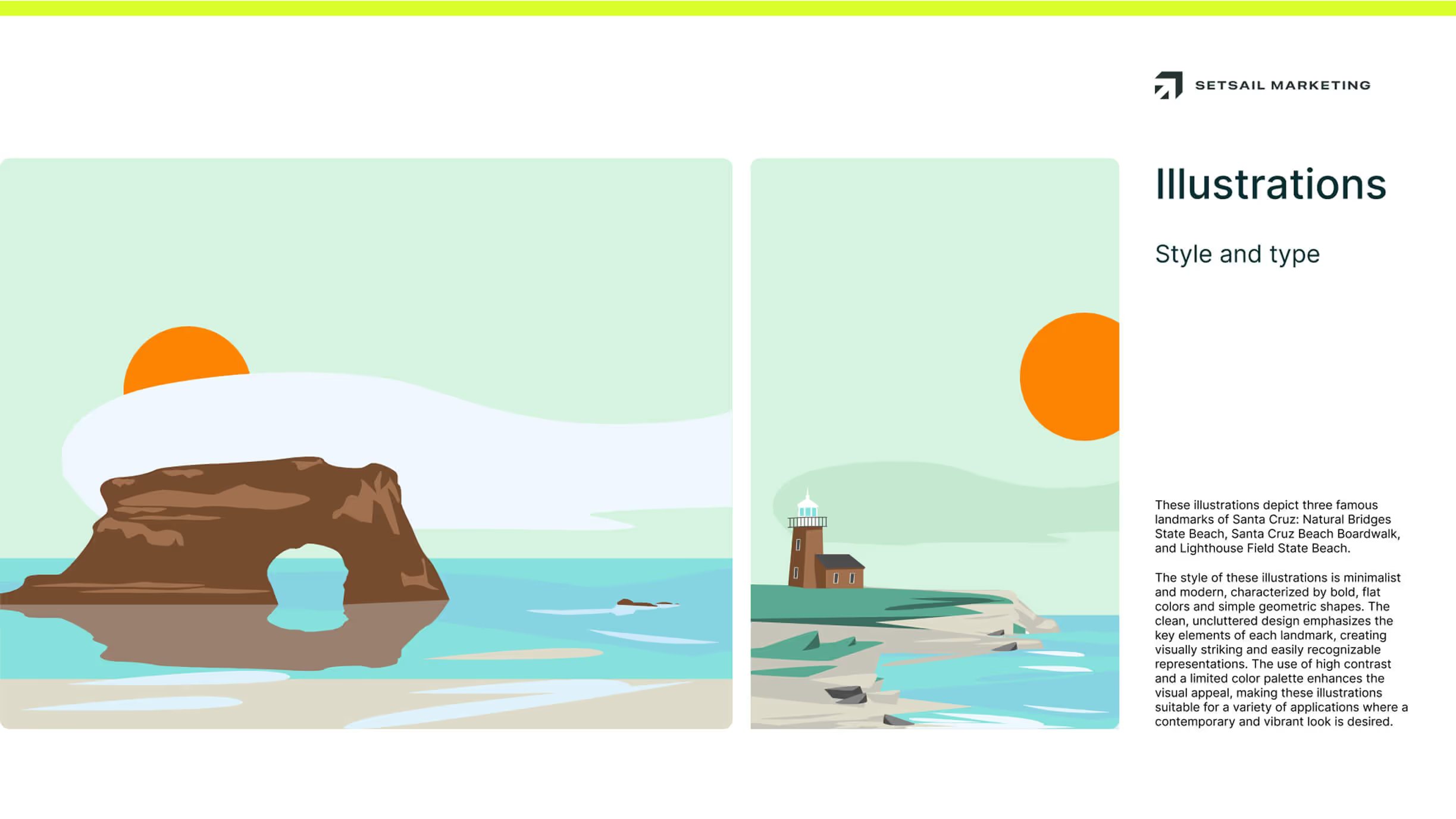
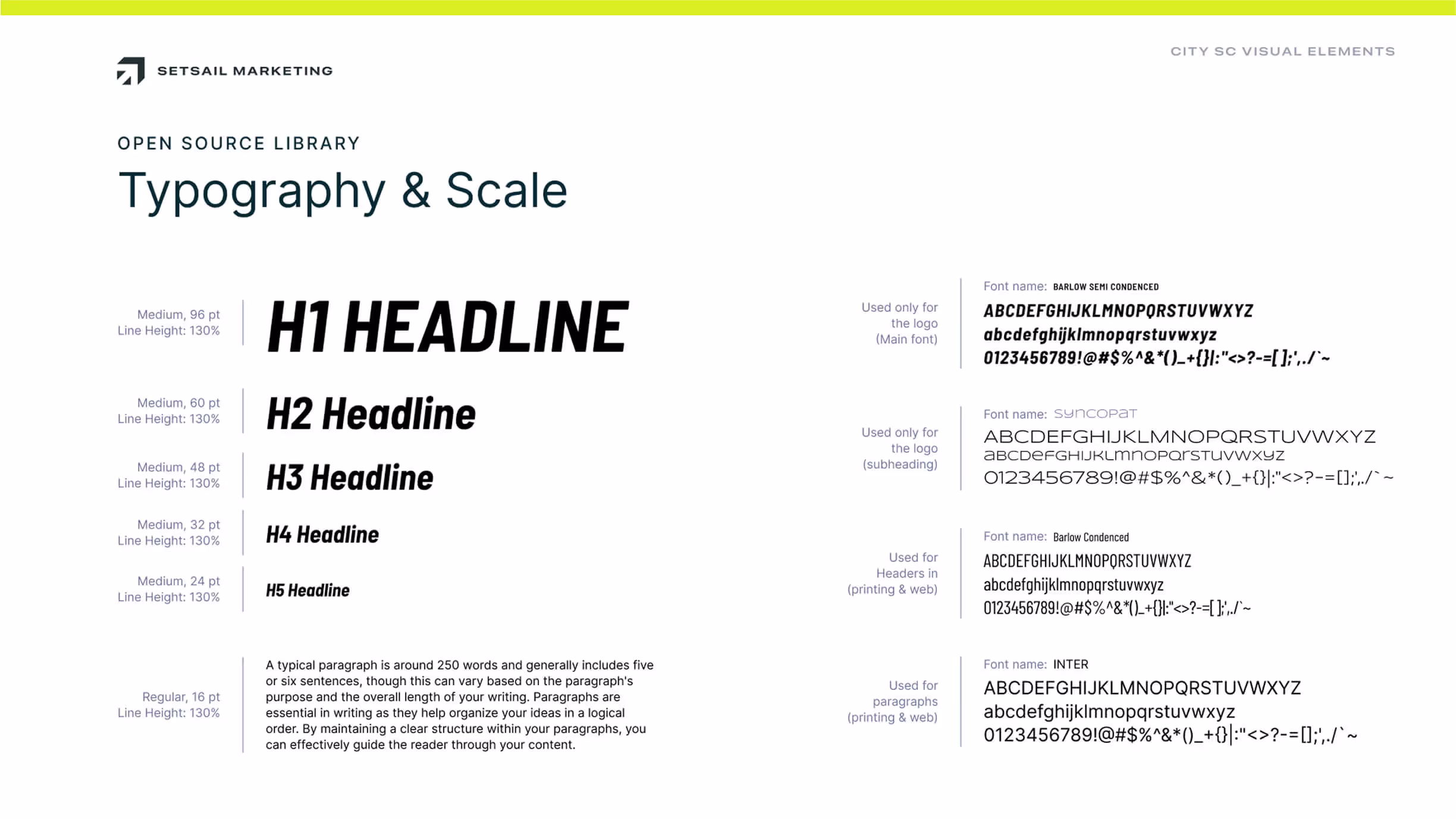
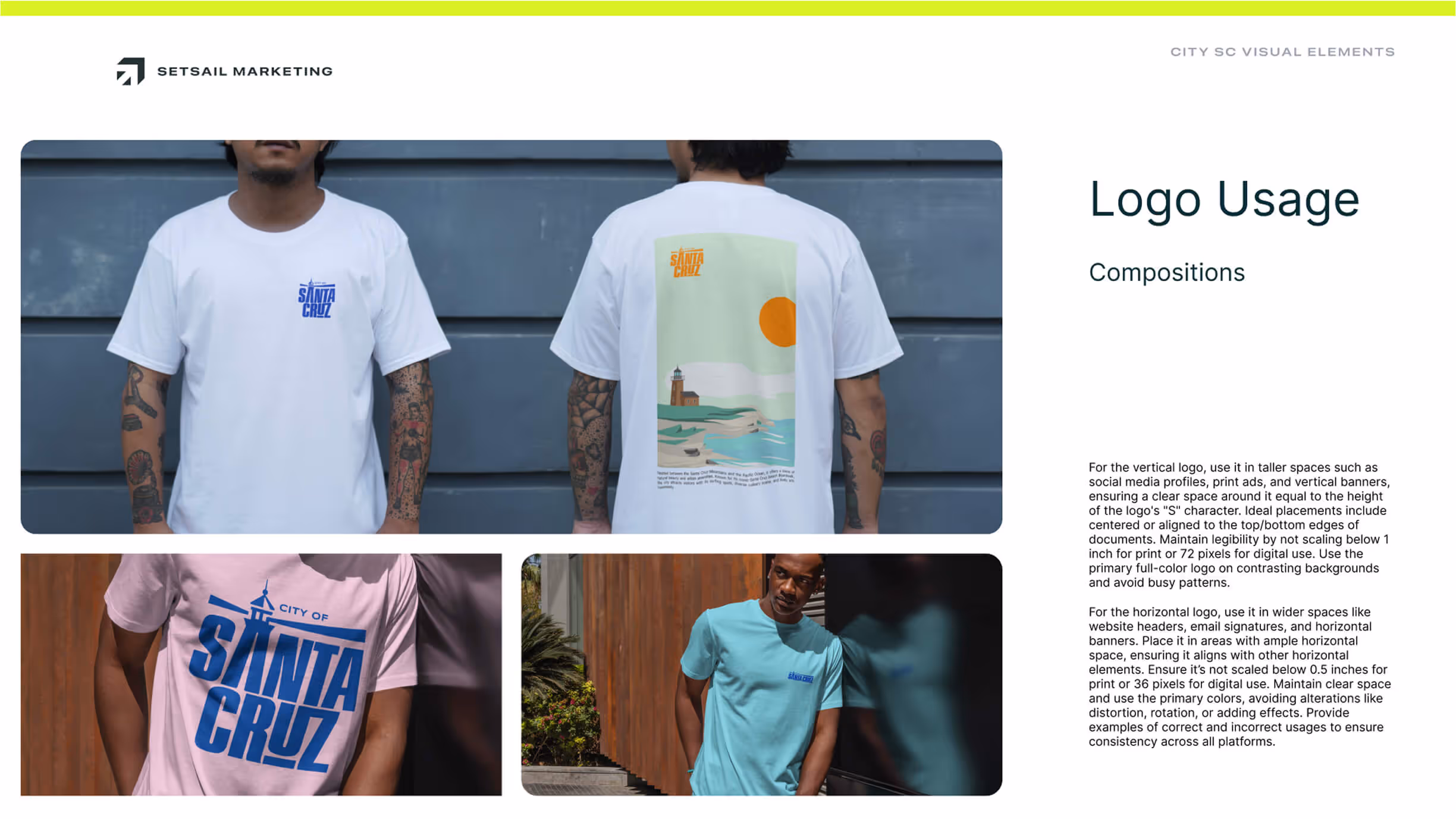
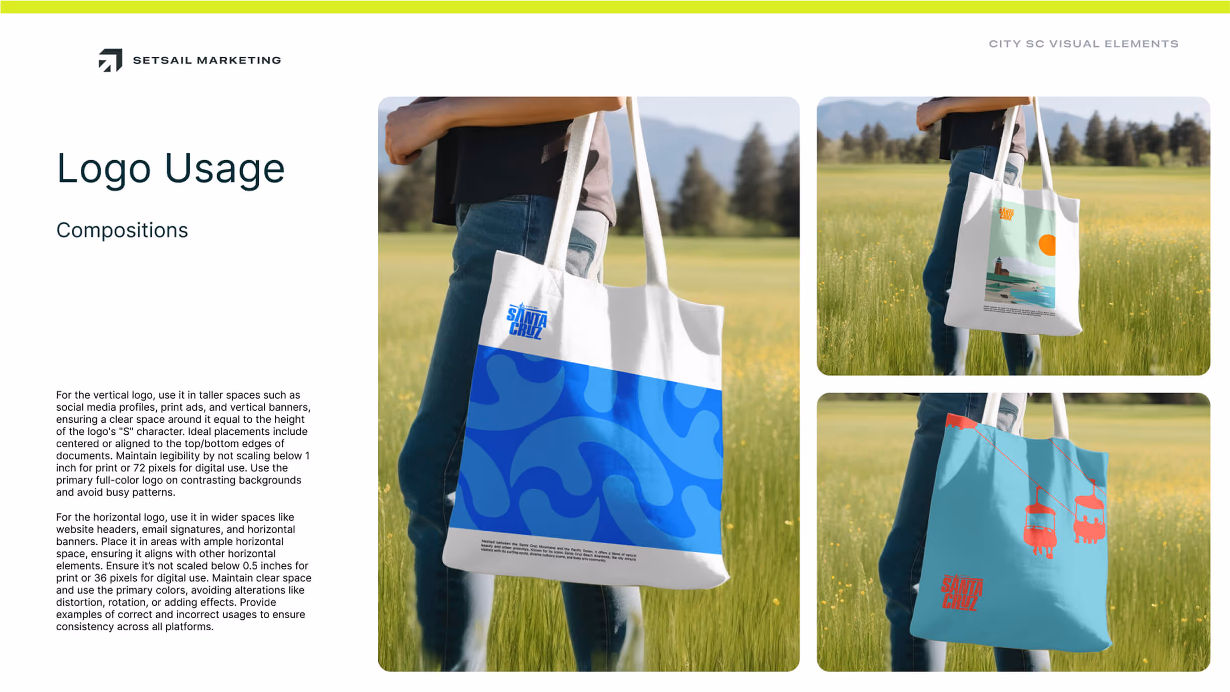
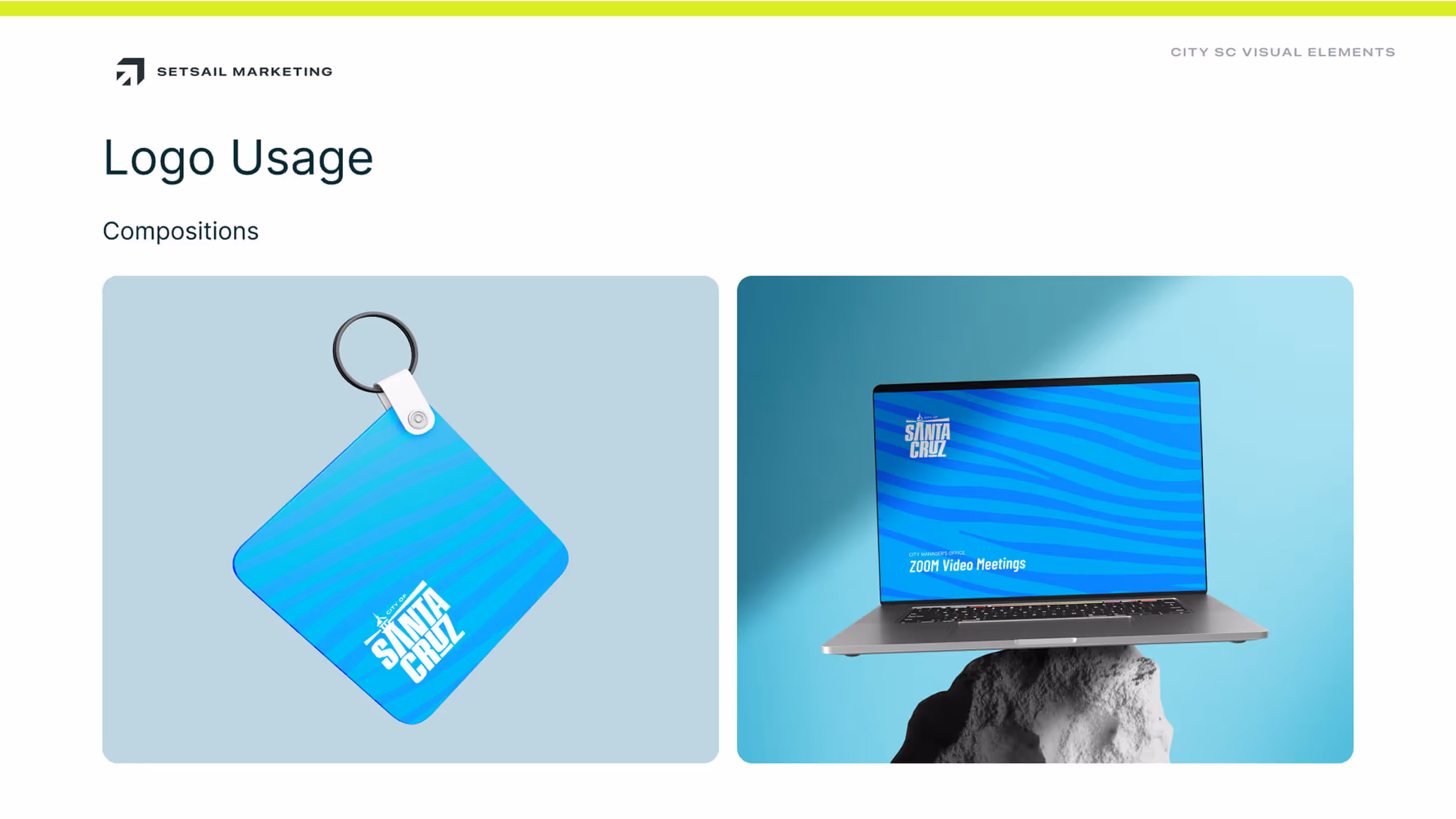
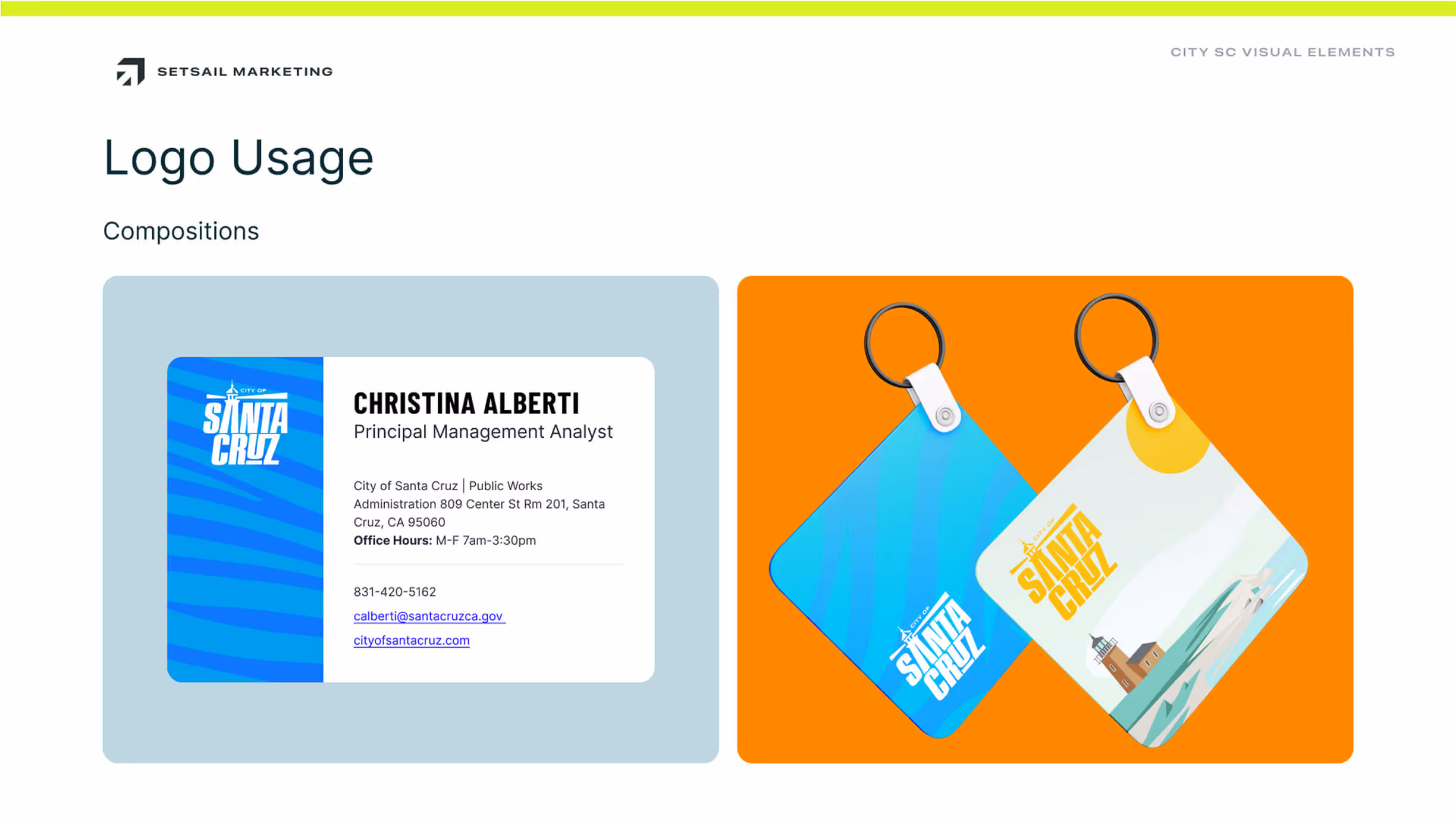
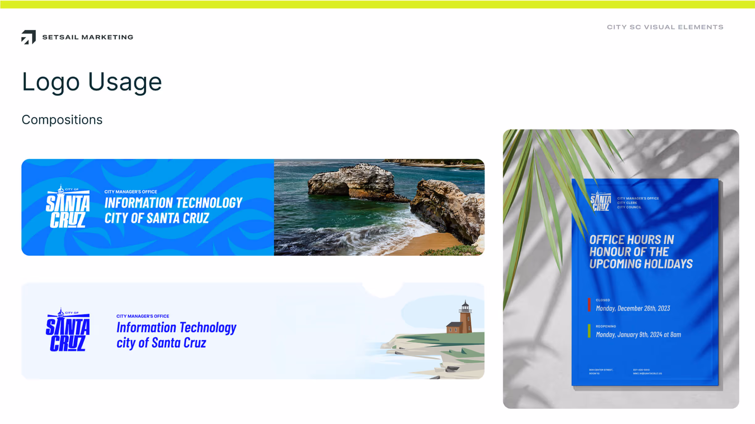
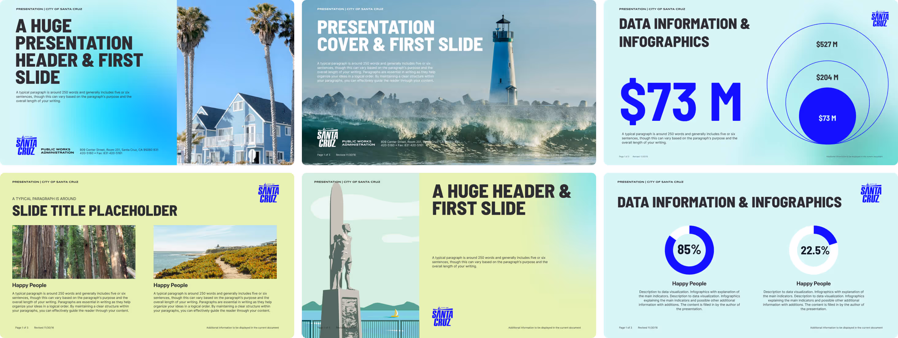
- Brand identity design. We developed distinct routes for a refreshed visual system—including logo redesign options, typography, colour, and layout grids—with accessibility and legibility at the core. We planned for multi-department execution before we drew the first line.
- Communication plan. We built an integrated plan covering web, print, signage, social, media relations, and community engagement—with KPIs and a maintenance cadence so the brand isn’t a one-and-done reveal but an operational habit.
Throughout, we treated this as a rebranding case study in disciplined stakeholder alignment: fewer slogans, more clarity; fewer formats, more consistency; fewer approvals, more enablement.
Creative Process
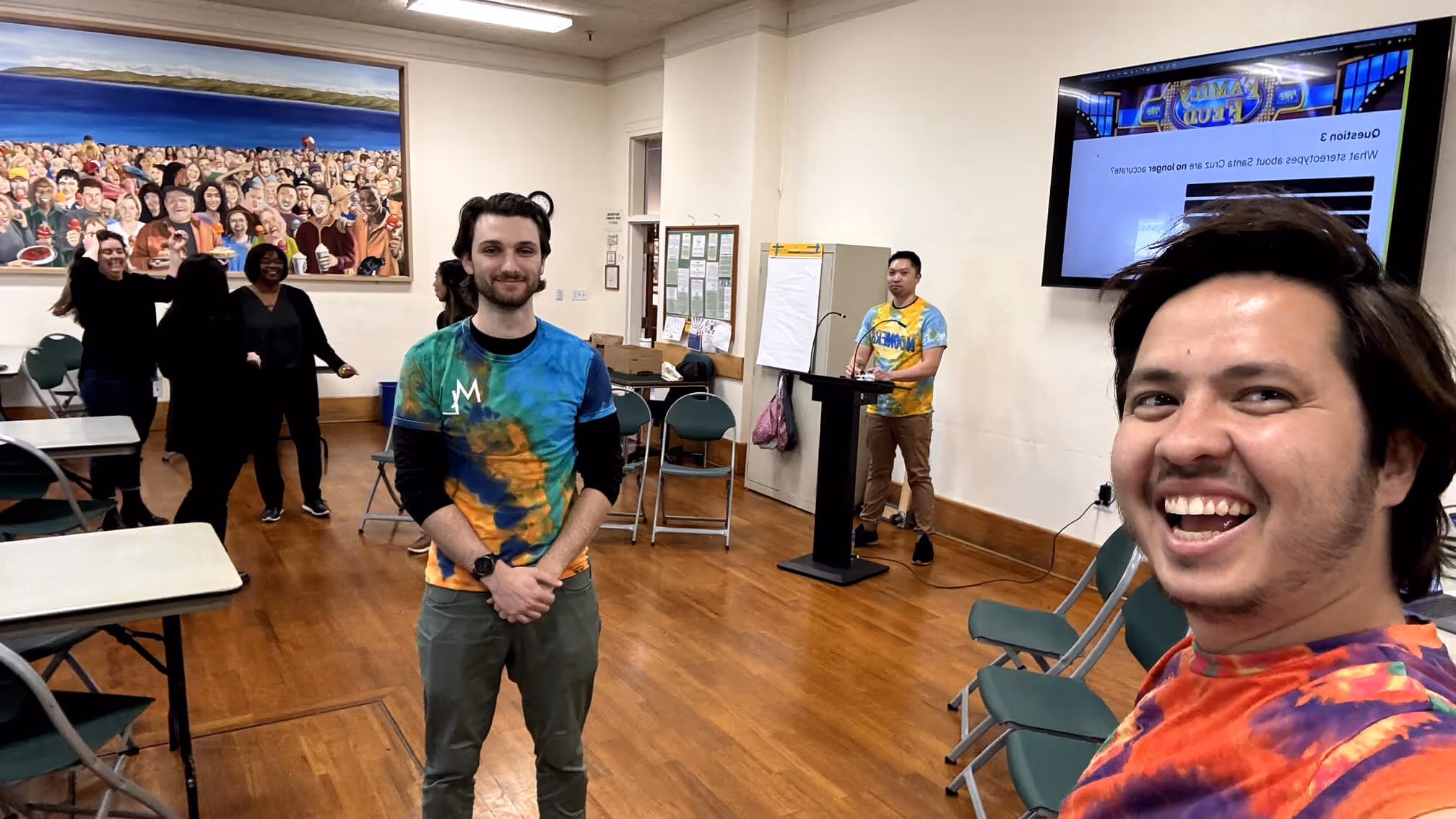
Discovery to direction. We started with stakeholder interviews (Mayor/Council offices, City Manager’s Office, department leads) and frontline staff. We isolated message friction: internal teams worked hard, but the public wasn’t always seeing a single, empathetic voice.
Identity sprints. We built three fully-fledged design systems—each with a different balance of heritage and modernity—so decision-makers could compare whole systems, not single logos. Each route was tested for small-format clarity (badges, favicons), large-format impact (fleet, banners), and wayfinding usefulness.
Language first. We wrote the brand story and tone guidelines before final polish on the mark. Voice influences form; we wanted a system where friendly, plain-language copy sits naturally with a confident civic visual identity.
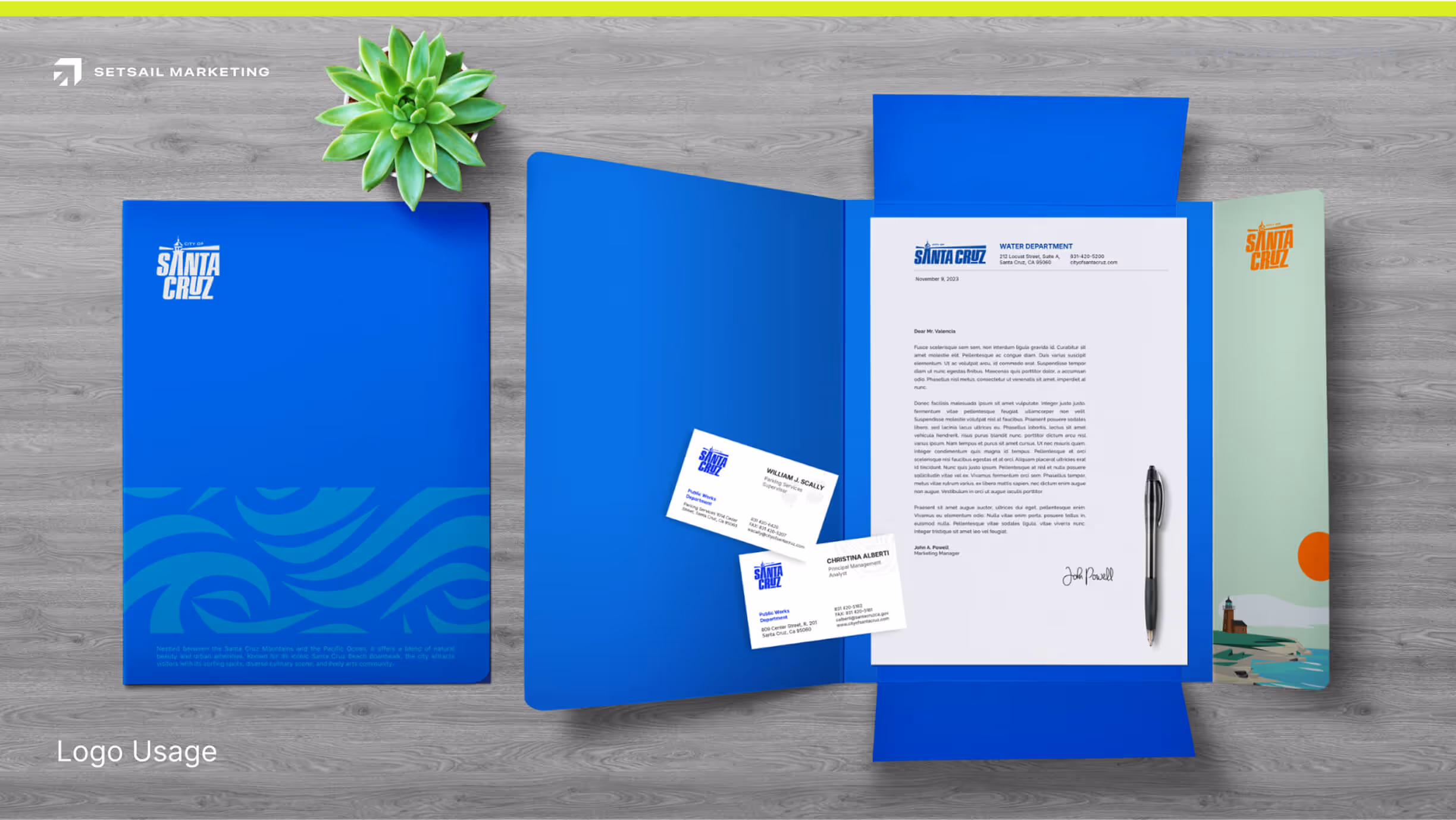
Toolkit thinking. We created a citywide brand toolkit with templates, do’s/don’ts, and pattern libraries so communications teams could execute fast without constant designer intervention. This is where brand identity design services create operational ROI.
Execution & Deliverables
Research deliverables
- A documented research plan; audience and sentiment findings; and an action plan to apply insights in services, outreach, and community engagement branding.
Strategy deliverables
- Brand purpose, values, personality, target audiences, positioning, and key messages—written to be copied and reused across departmental contexts (Utilities, Recreation, Economic Development).
- A cross-functional marketing strategy that aligned campaign priorities and evergreen information delivery.
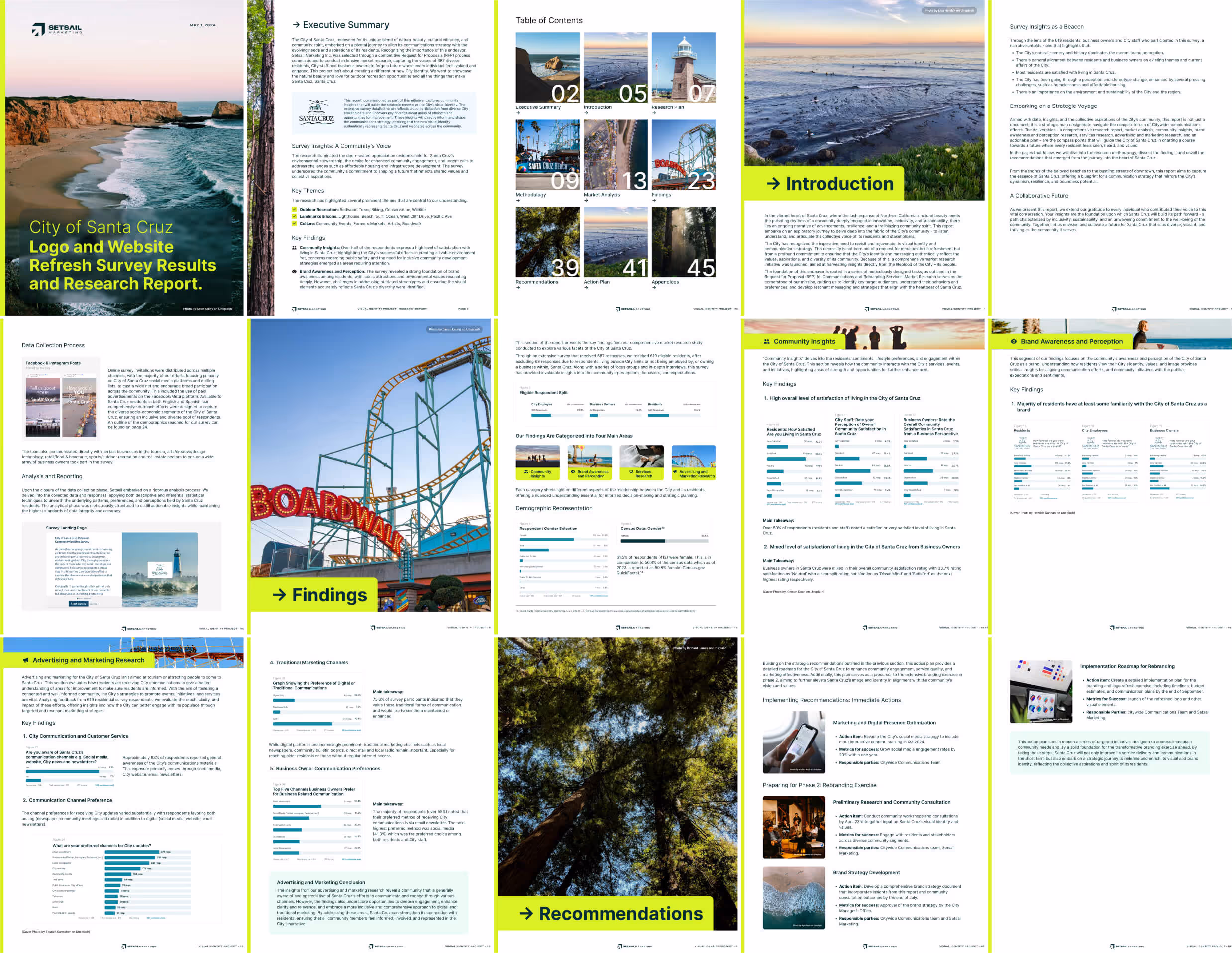
Identity deliverables
- Three distinct logo redesign directions; finalised master logo + lockups; typography; colour palette; iconography; layout system.
- Accessibility checks (contrast, legibility), plus wayfinding considerations for city facilities.
Toolkit deliverables
- A brand toolkit with templates for council reports, press releases, social posts, slide decks, mailers, signage, and fleet livery—delivered with editable files and rules to keep usage on-brand.
Communication plan
- An integrated digital marketing strategy and social media marketing strategy with content pillars, channel roles, cadence, and a measurement model.
- A maintenance rhythm and governance model so the city can review performance and update assets quarterly.
Project management
- Clear workback schedules, risk registers, and decision logs; status updates and a closeout report per the City’s requirements.
Tangible Outcomes (KPIs, quotes, business impact)
We measure rebrands on adoption and clarity before we talk hype. For municipal projects, “success” is everyday usability.
Operational outcomes
- Toolkit adoption. Departments used the new templates within weeks; requests for ad-hoc design tasks dropped meaningfully as staff self-served from the library.
- Message clarity. Plain-language guidelines reduced copy length and increased completion rates on key notices (e.g., service updates).
- Governance. A lightweight review process replaced rounds of subjective edits, freeing leadership time.
Communication outcomes
- Channel cohesion. Social posts, press releases, and web updates now look and read like they come from one City.
- Engagement signals. Early indicators showed steady lifts in reach and reactions on community updates; sentiment in comments improved as message tone normalised.
Measurement we tracked
- Brand-asset adoption by department
- Template usage vs. bespoke design requests
- Web clarity indicators (task completion, time on task for top resident services)
- Social reach and engagement trends by content pillar
- Media pickup and message consistency
What we heard
- “It’s easier to communicate quickly without sacrificing consistency.” — Internal comms lead (paraphrased)
- “Residents recognise the City immediately—signage, posts, and notices match.” — Facilities manager (paraphrased)
These results reflect the City’s original objectives—brand revitalisation, increased awareness, improved perception, and ongoing support—codified in the RFP scope and deliverables.
Lessons Learned
Design for enablement, not theatre. Civic brands live in staff hands. Templates, rules, and governance create more value than one-off hero visuals.
Language is the first design system. The most visible improvement came from consistent tone. The brand strategy and messaging architecture made every department sound like one team.
Invest in maintenance. The quarterly review cadence is where small fixes prevent big drift. A brand that learns together stays together.
Next steps we recommend
- Extend the communication plan with community co-creation—short resident panels to pressure-test messages for clarity before citywide rollouts.
- Launch a citywide content marketing strategy that turns recurring services (permits, recreation, recycling) into helpful, repeatable series.
- Layer destination and economic development messaging into the same system so tourism and business climate strengthen the core city branding story (think destination branding without creating a competing sub-brand).
- Continue staff training—brief, hands-on clinics for power users in each department to keep the toolkit alive.
Project FAQs
What is city branding and why does it matter for municipalities?
City branding is the process of creating a unified brand identity that reflects a municipality’s values, services, and community. For cities like Santa Cruz, a strong brand strategy builds trust, improves communication, and increases engagement across residents, businesses, and visitors. It’s more than a logo redesign—it’s a marketing strategy that strengthens perception and clarity.
How does a rebranding strategy improve government communications?
A rebranding strategy aligns messaging, visuals, and tone across all departments. For government communications, this means fewer mixed signals and clearer service delivery. In Santa Cruz, our rebranding approach combined brand identity design services with a communication plan, ensuring residents immediately recognised and trusted messages from the City.
What services did Setsail provide for the City of Santa Cruz project?
We delivered a full suite of services: market research, brand strategy, brand identity design, logo redesign, and a citywide brand toolkit. We also built a digital marketing strategy and communication plan to unify outreach. These services gave the City a consistent, scalable brand identity and measurable improvements in community engagement.
How does municipal branding differ from corporate rebranding?
Municipal branding focuses on trust, accessibility, and service clarity, while corporate rebranding often prioritises market growth and differentiation. For Santa Cruz, the goal wasn’t profit—it was public trust. We created a brand identity that supported city services, community engagement, and long-term sustainability, balancing heritage with modern communication needs.
How do I get started with Setsail Marketing?
It’s simple. Visit Setsail Marketing’s Branding & Identity page to explore our services, or contact us directly. Whether you need a full rebranding strategy, brand identity design, or a municipal marketing strategy, we’ll create a clear path to stronger engagement and measurable results.
FULL SERVICE DIGITAL MARKETING AGENCY
Your Digital Marketing Agency for Real Results
✓ Fixed timelines.
✓ Fixed deliverables.
✓ Fixed price.
Book a free audit call In-Person or over a Zoom Call

Proven process tested on 200+ successful companies
Proven process tested on 200+ successful companies
Proven process tested on 200+ successful companies
Proven process tested on 200+ successful companies
Proven process tested on 200+ successful companies
Proven process tested on 200+ successful companies
Proven process tested on 200+ successful companies
Proven process tested on 200+ successful companies